
Kast (2016)
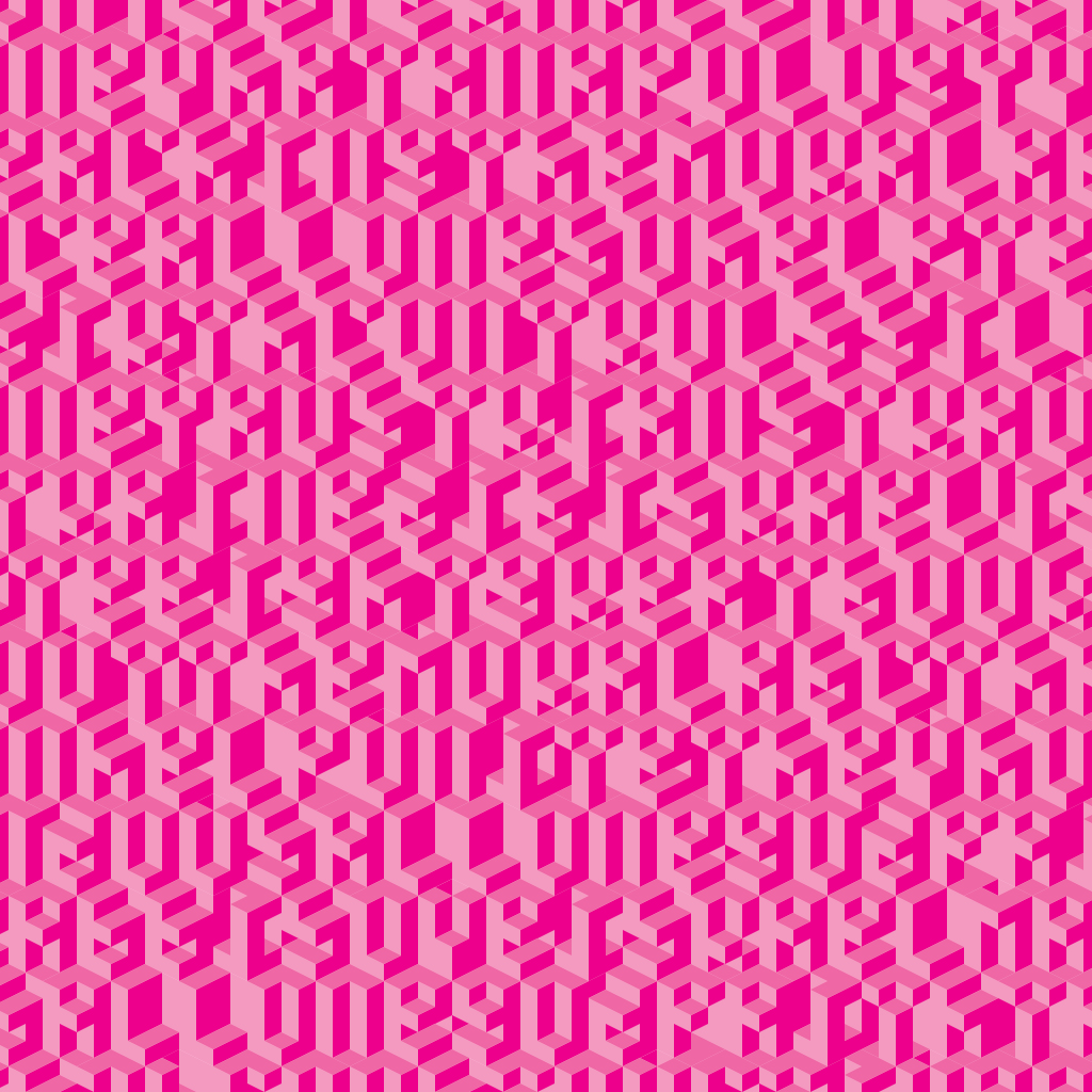
The first version of Kast was an example I created for intro type students at the University of Illinois. I’d seen a collection of display lettering made with vector graphics at FontFabric called Cube 02. I showed it to students as an example of a draft design, then showed them the letters I made as one way to refine that draft, to make it more true to the logic of its construction.

Initially I’d just made 26 letters of what is now the ‘filled’ version of Kast to show the students, and kept the work in Illustrator. In the spring of 2015 I began to systematically work out the different variations and their components, and to build them in Glyphs as a working font. I finished the work in the summer of 2016 and submitted the design to the Society of Typographic Aficionados’s international >protoType competition. Kast was a jury finalist, and it was included in an exhibition at SOTA’s annual TypeCon in Seattle that fall.
Personally I’m drawn most to the ‘top-right’ version, which combines the impression of an isometrically-projected wall of blocks with an almost calligraphic form in the ‘shadows’.
It was in refining and expanding Kast that I first began to wonder what it was we meant when we called lettering or font ‘modular’ in the first place, and to investigate the formal logic of modularity.
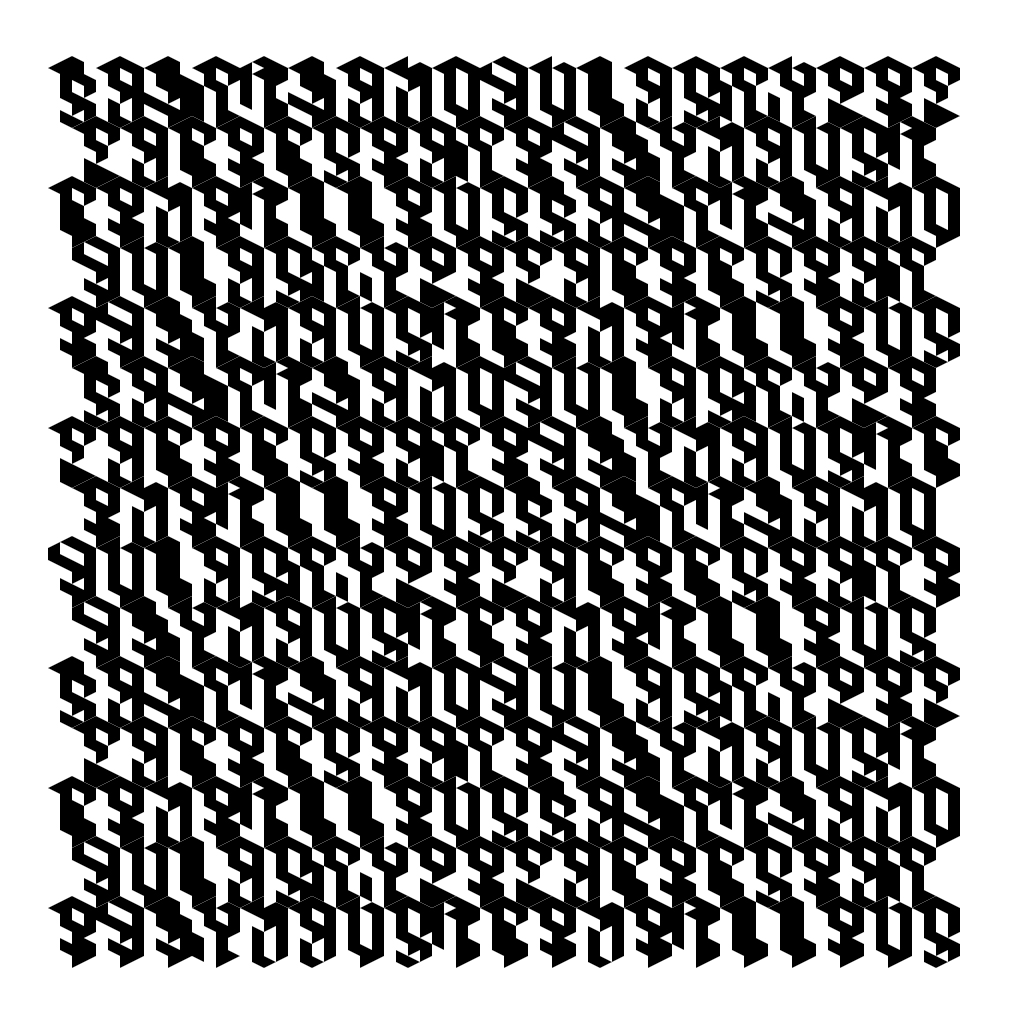
In subsequent studies with code I’ve made Kast’s design properly isometric. Eventually I’ll update the fonts, and I’d also like to make a variable version of the family, with axes for the fills of the different sides of the virtual cubes.
It was in refining and expanding Kast that I first began to wonder what it was we meant when we called lettering or font ‘modular’ in the first place, and to investigate the formal logic of modularity.
In subsequent studies with code I’ve made Kast’s design properly isometric. Eventually I’ll update the fonts, and I’d also like to make a variable version of the family, with axes for the fills of the different sides of the virtual cubes.