
It’s been said by a number of people, among them his biographer Frederike Huygen, that Jurriaan Schrofer was a computer designer in all but name. True as that is, he also made smart compromises with his analog materials.
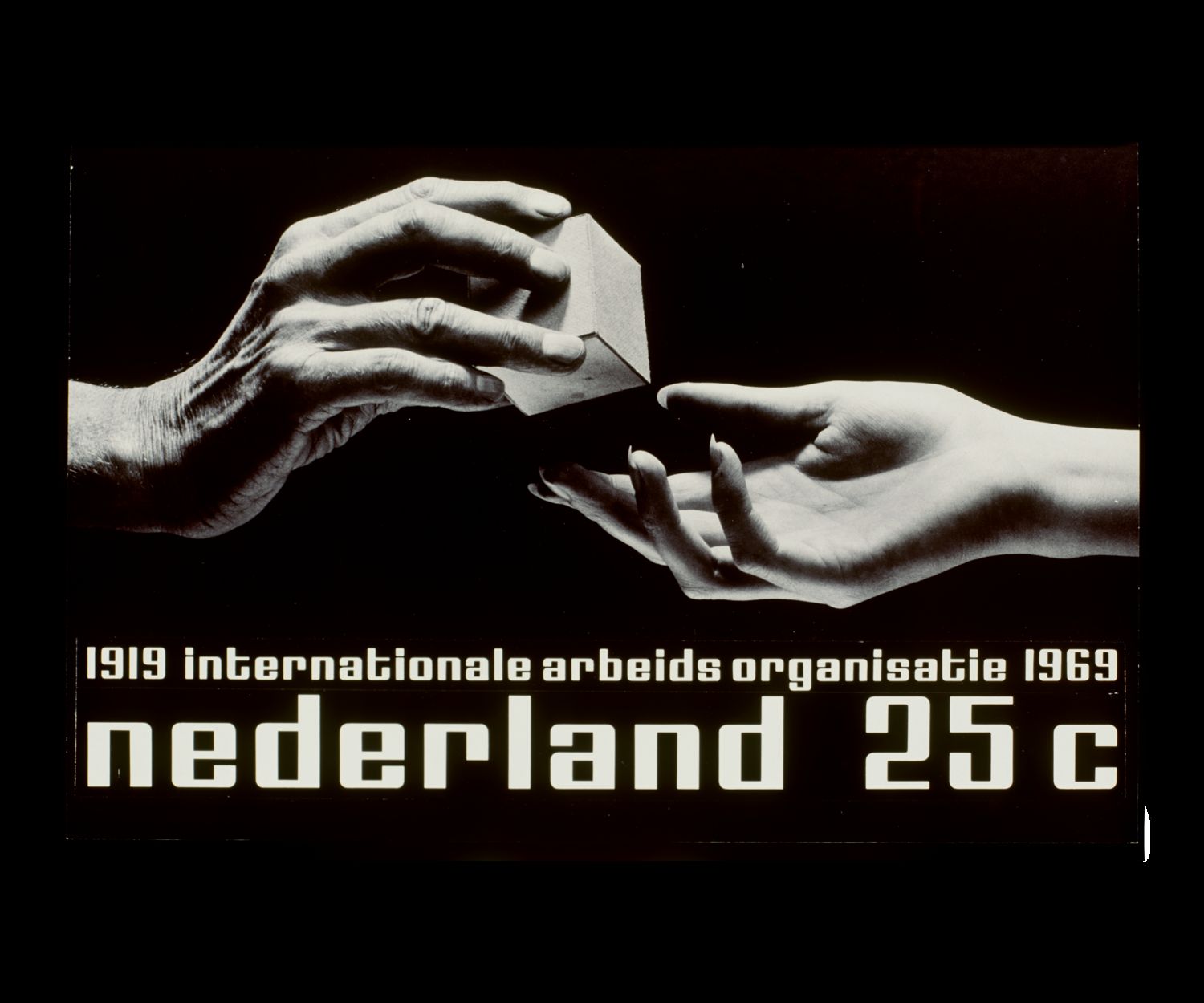
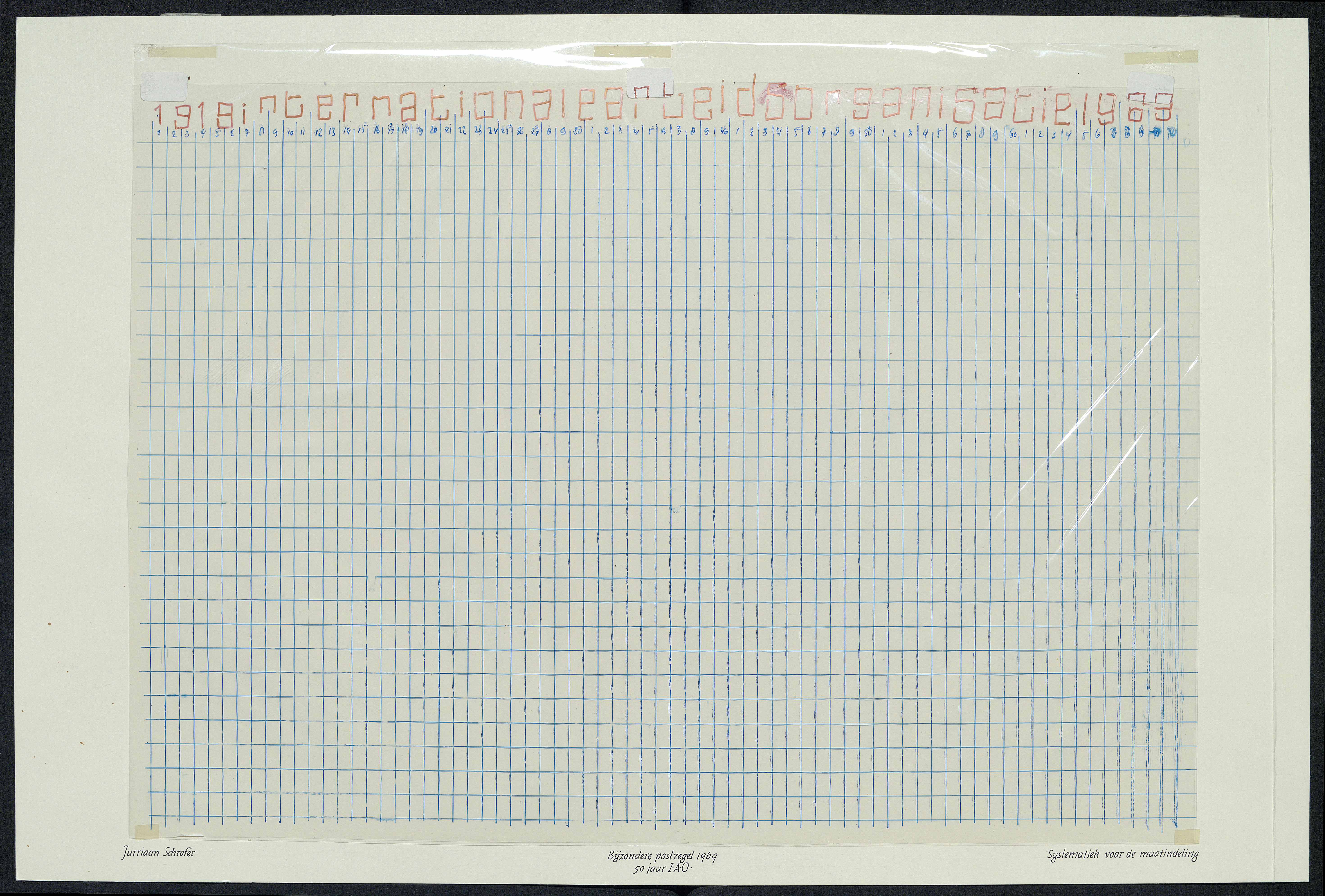
In 1968, the Dutch PTT (Posterijen, Telegrafie en Telefonie; the Dutch post office) commissioned Schrofer to design a stamp to celebrate the 50th anniversary of the the International Labor Organization—in Dutch, Internationale Arbeidsorganisatie (IAO)—in 25c and 45c (gulden) denominations.
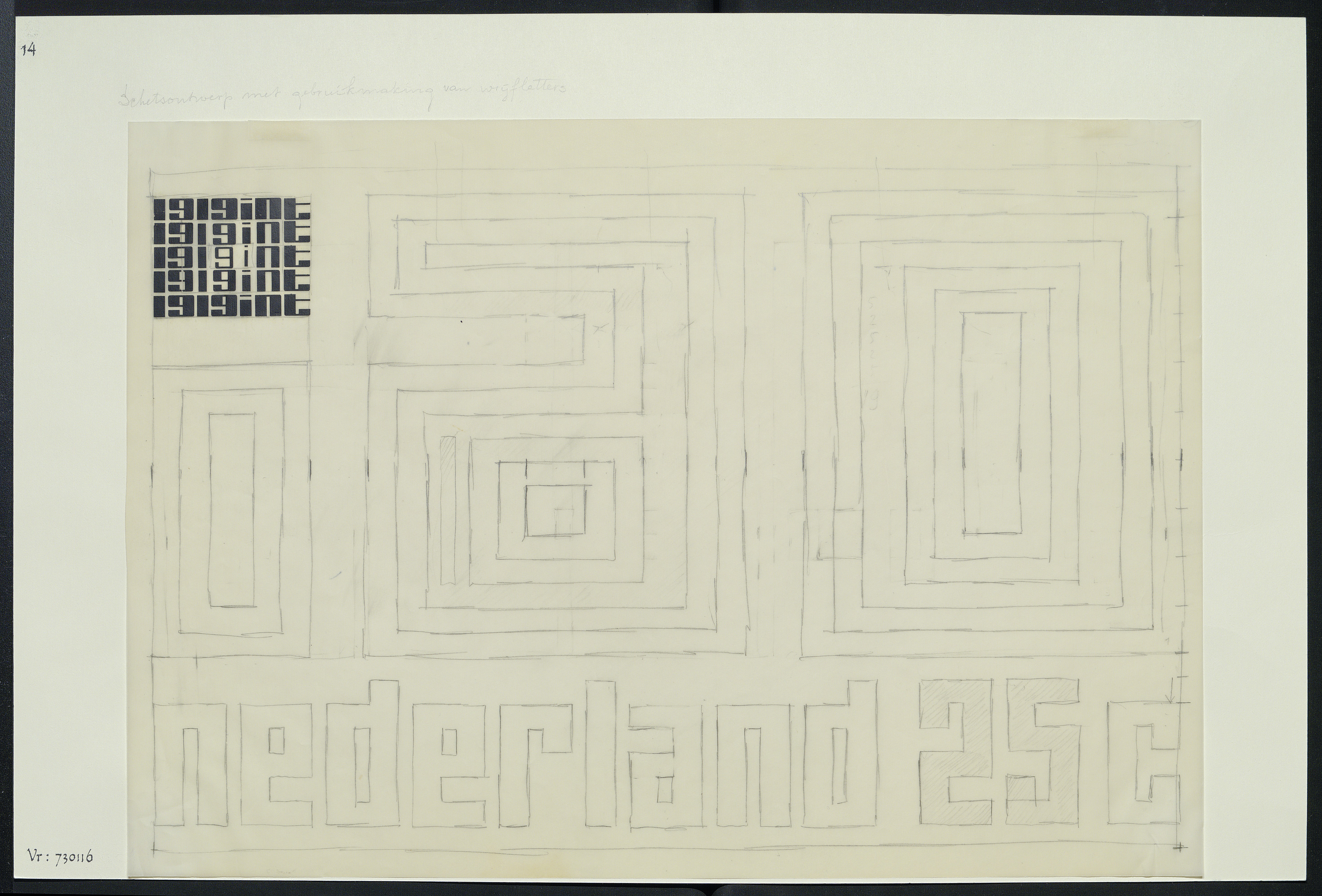
Schrofer drafted two options for the stamps; one was based on a photographic image, with lettering based on a design Schrofer had been using since the early 1960s.
 (Jurriaan Schrofer Archive, Allard Pierson, University of Amsterdam)
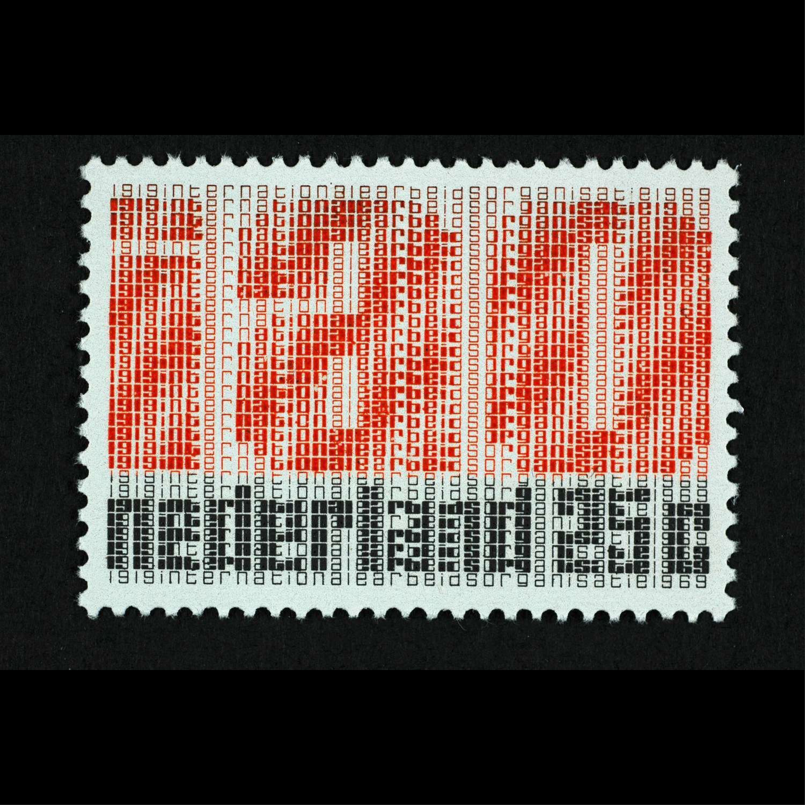
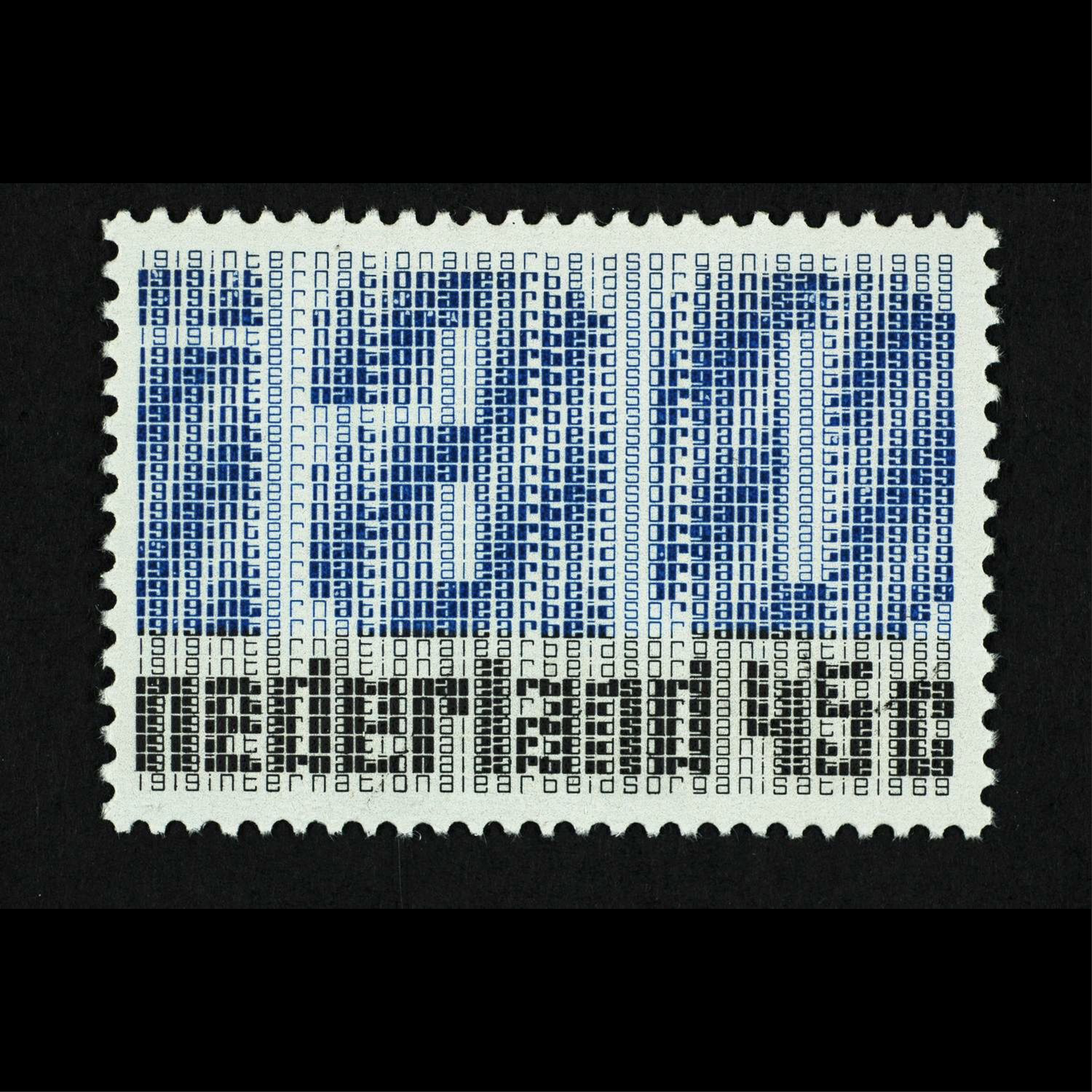
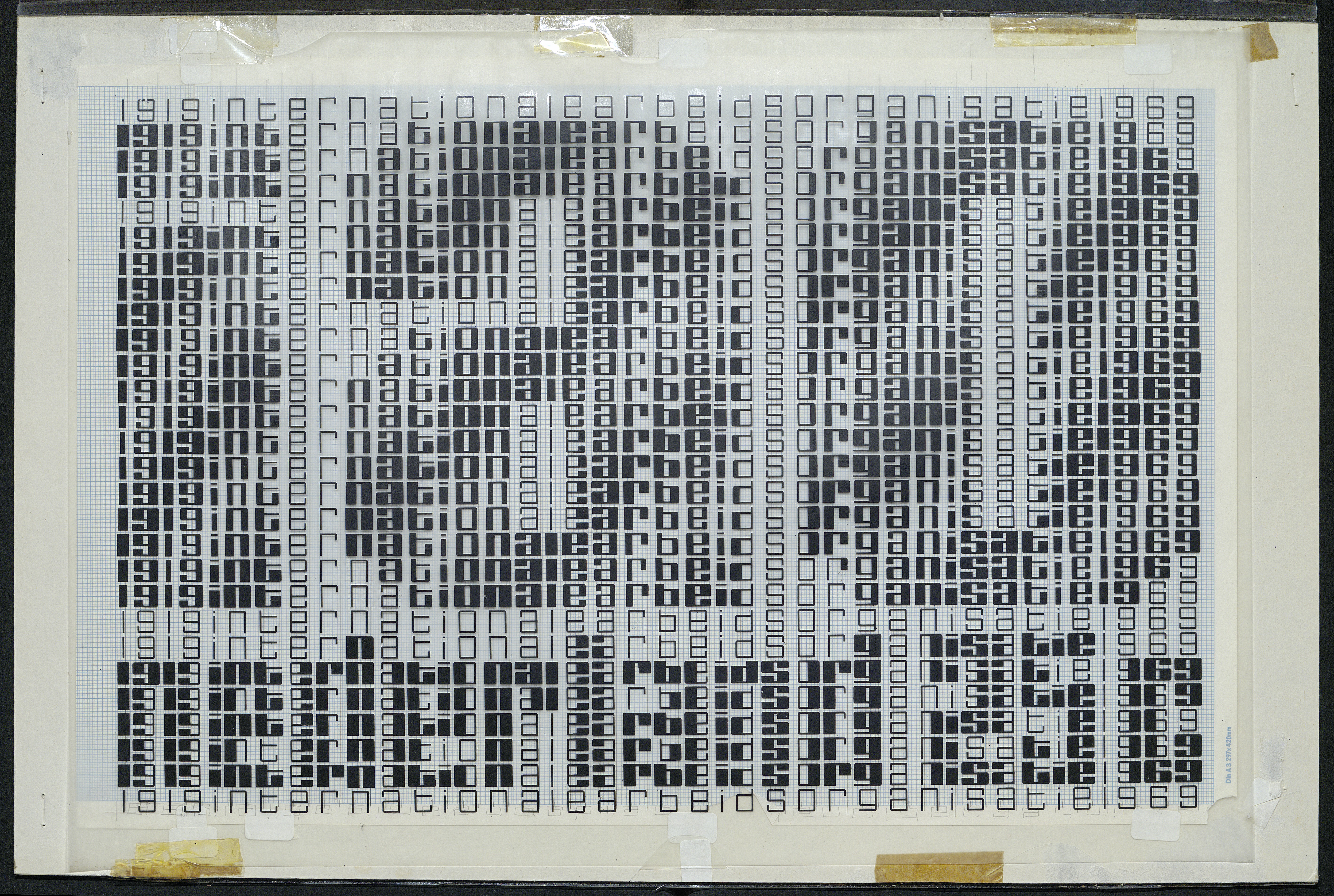
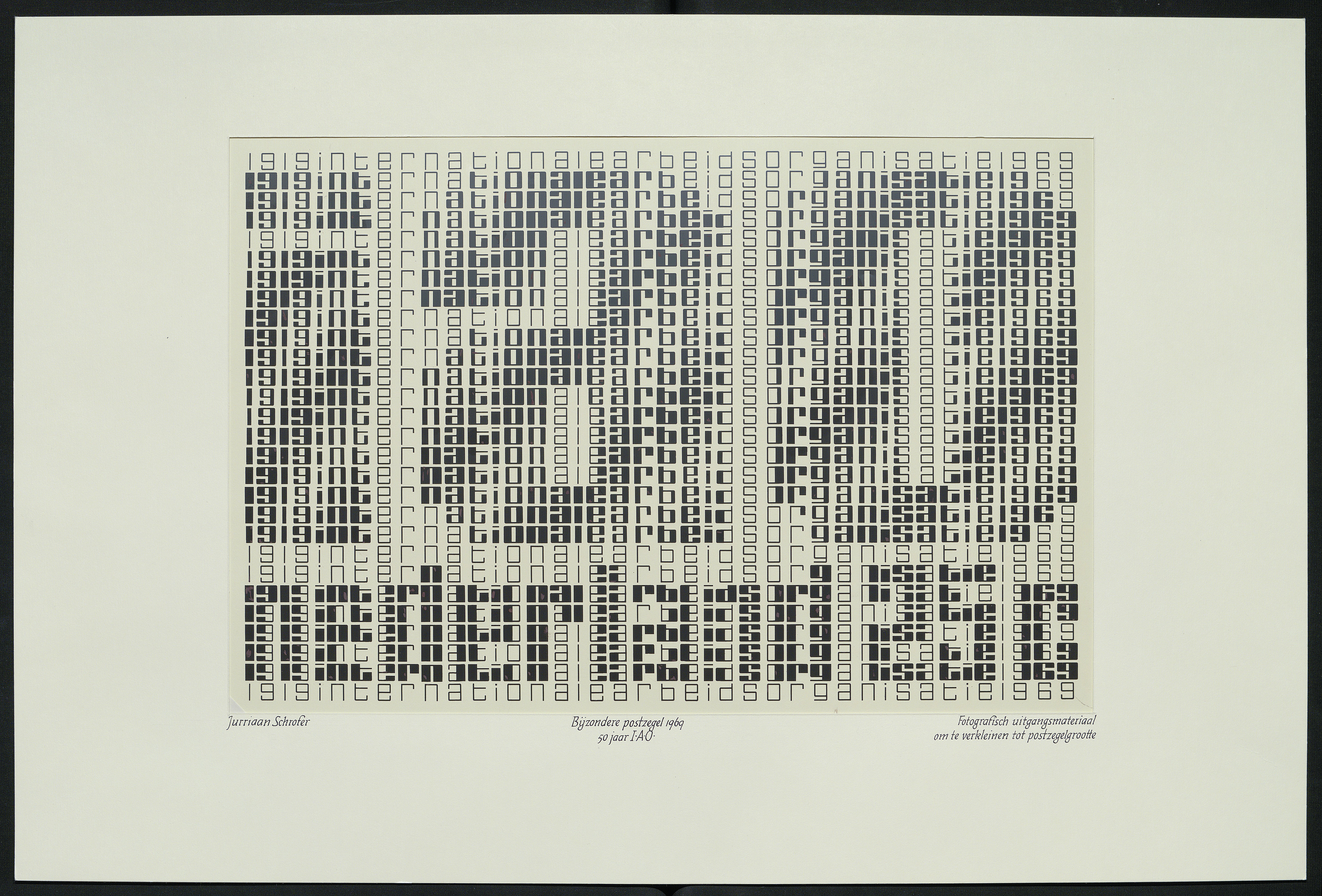
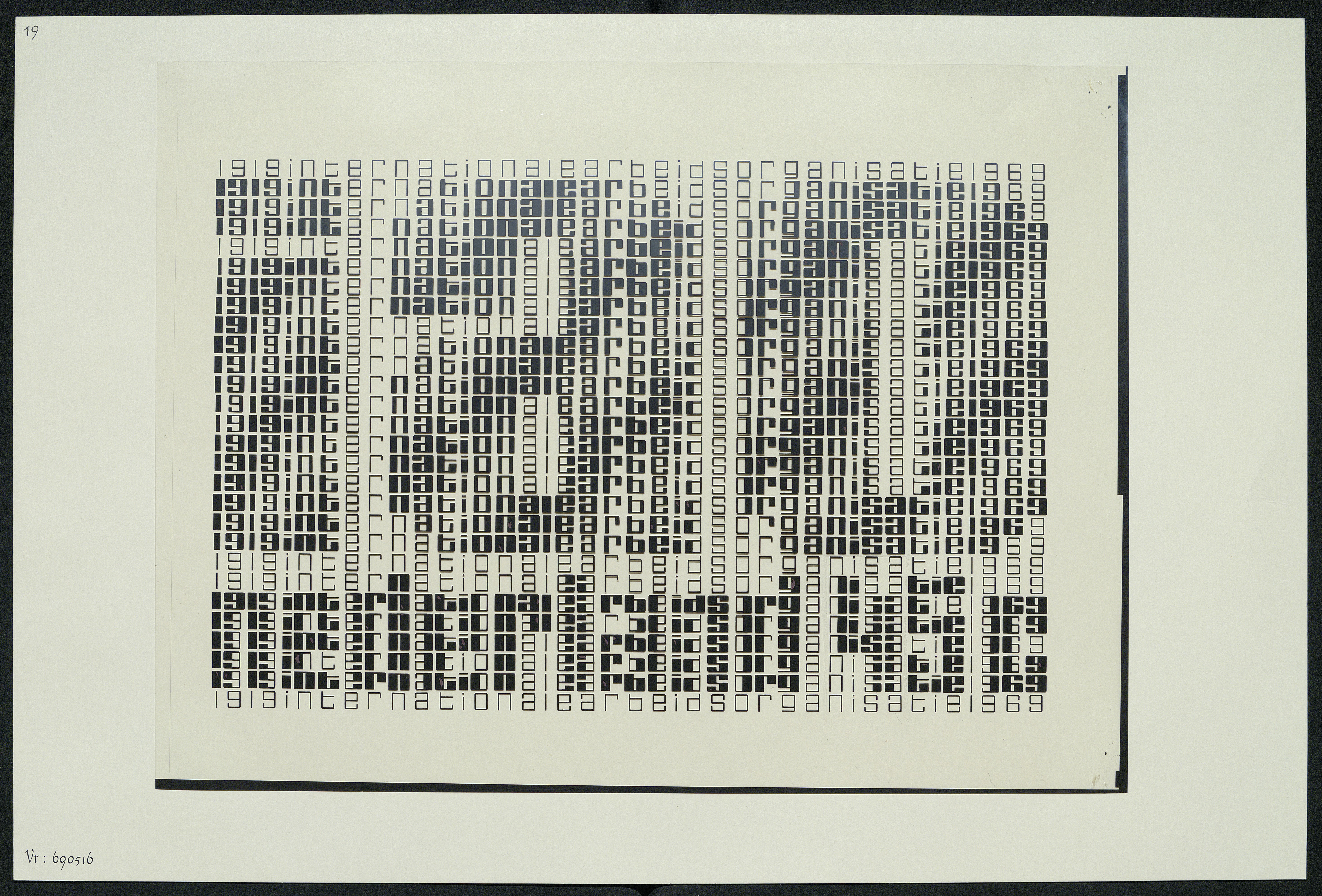
The direction the PTT chose, Schrofer’s own favored option, used a field of small letters in different weights as image elements—pixels, though Schrofer wouldn’t have used that term—to create a text of larger rasterized letters.
 (Jurriaan Schrofer Archive, Allard Pierson, University of Amsterdam)
The larger letters for ‘IAO Nederland 25/45c’ are fairly simple block letters.

(Nationaal Archief Nederlands)
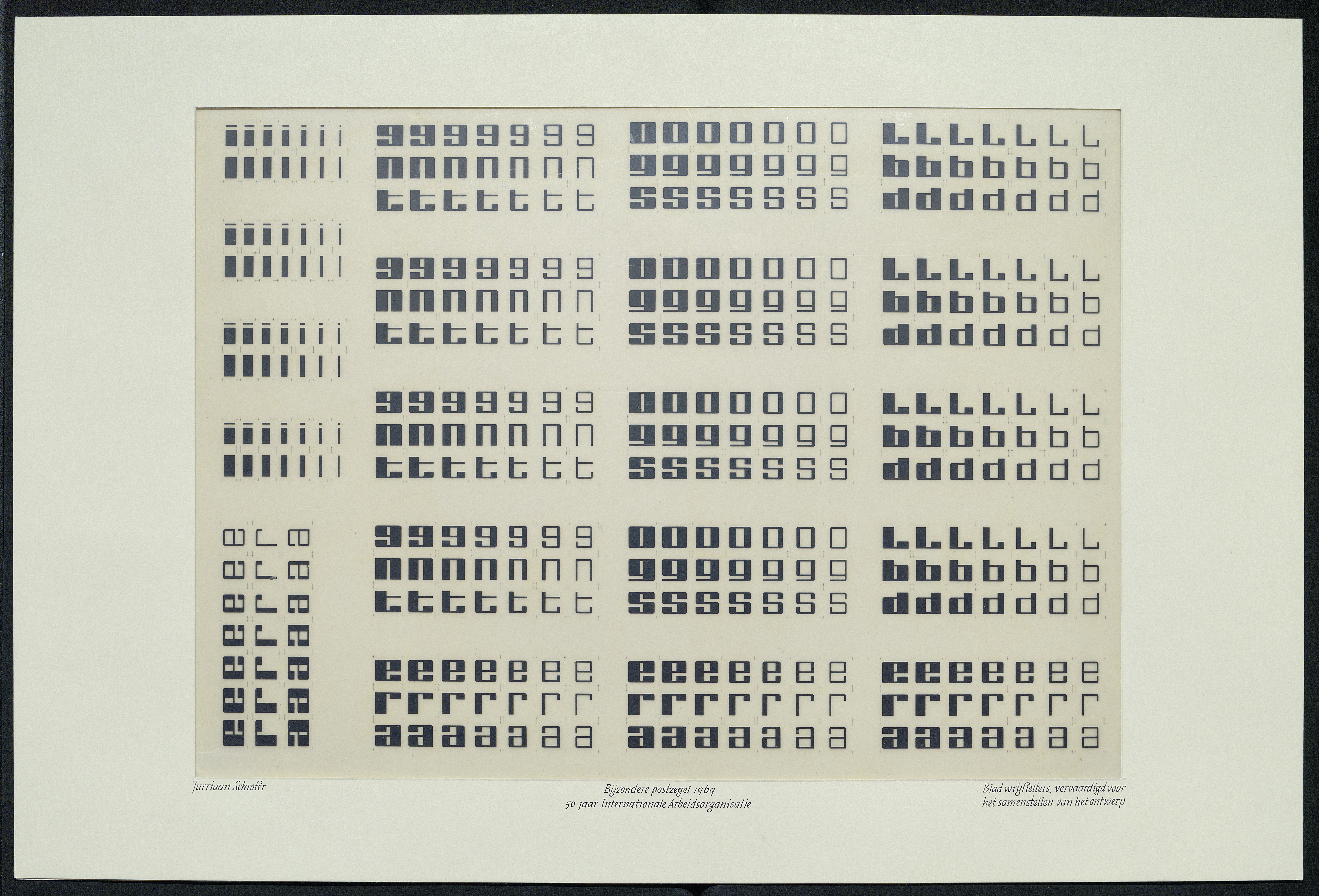
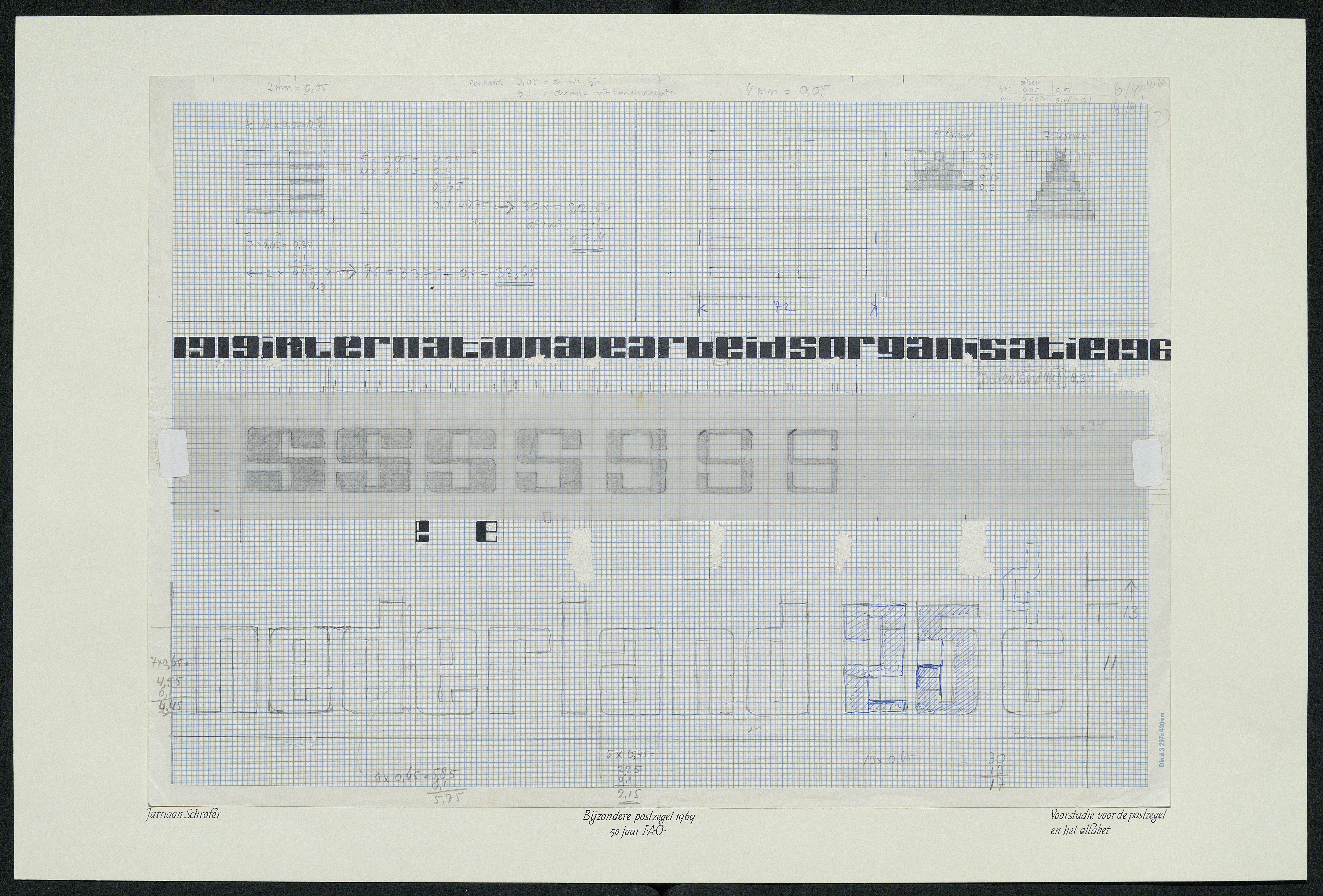
The smaller element letters are variants on a script design that Schrofer had been using since the early 1960s.
(Nationaal Archief Nederlands)
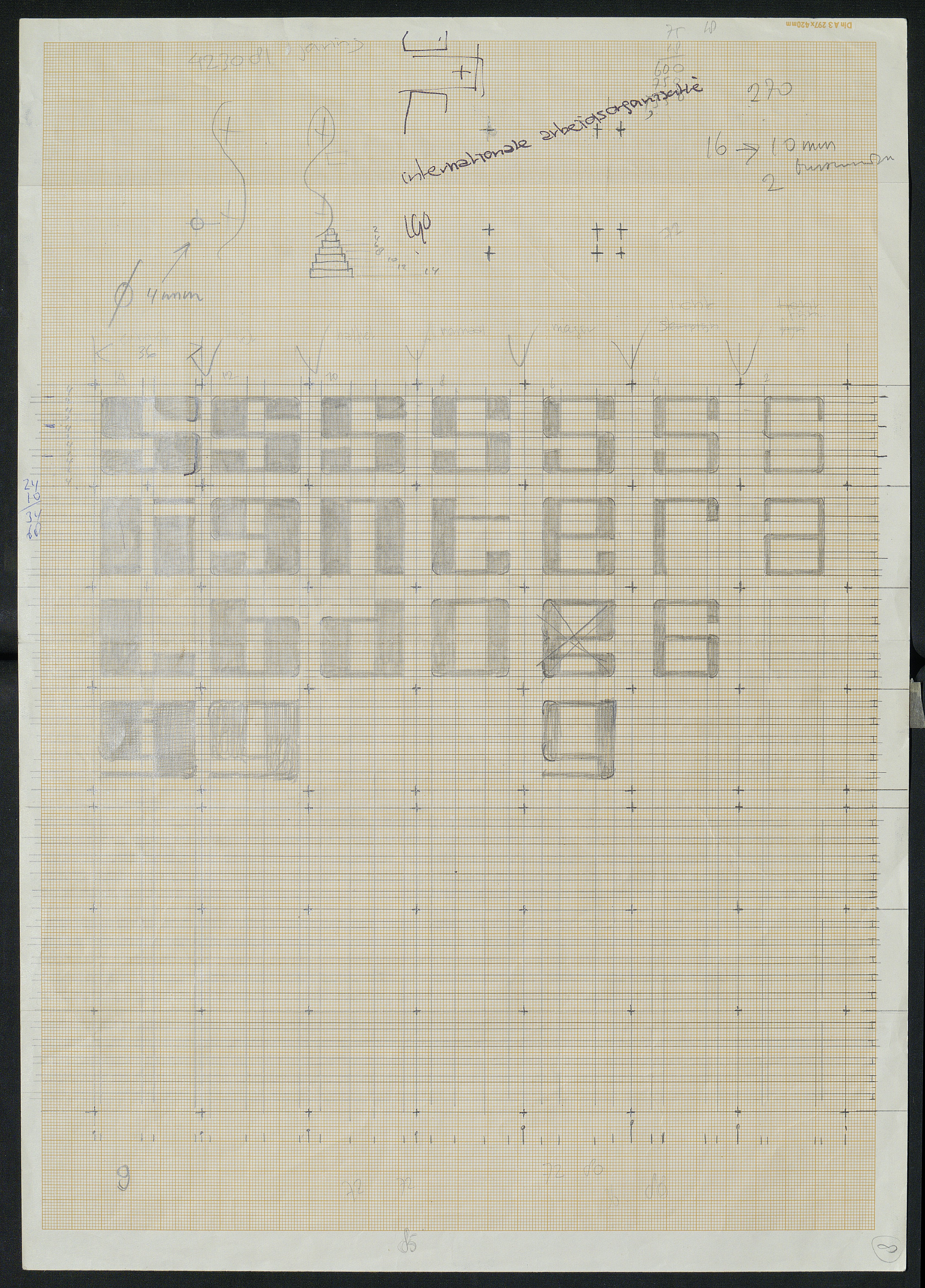
Schrofer’s initial plan was to vary both the horizontal and vertical strokes of the element letters. But finally he chose to only vary the vertical strokes—simplifying the design in some ways, making it more complex in others.
(Jurriaan Schrofer Archive, Allard Pierson, University of Amsterdam)
(Nationaal Archief Nederlands)
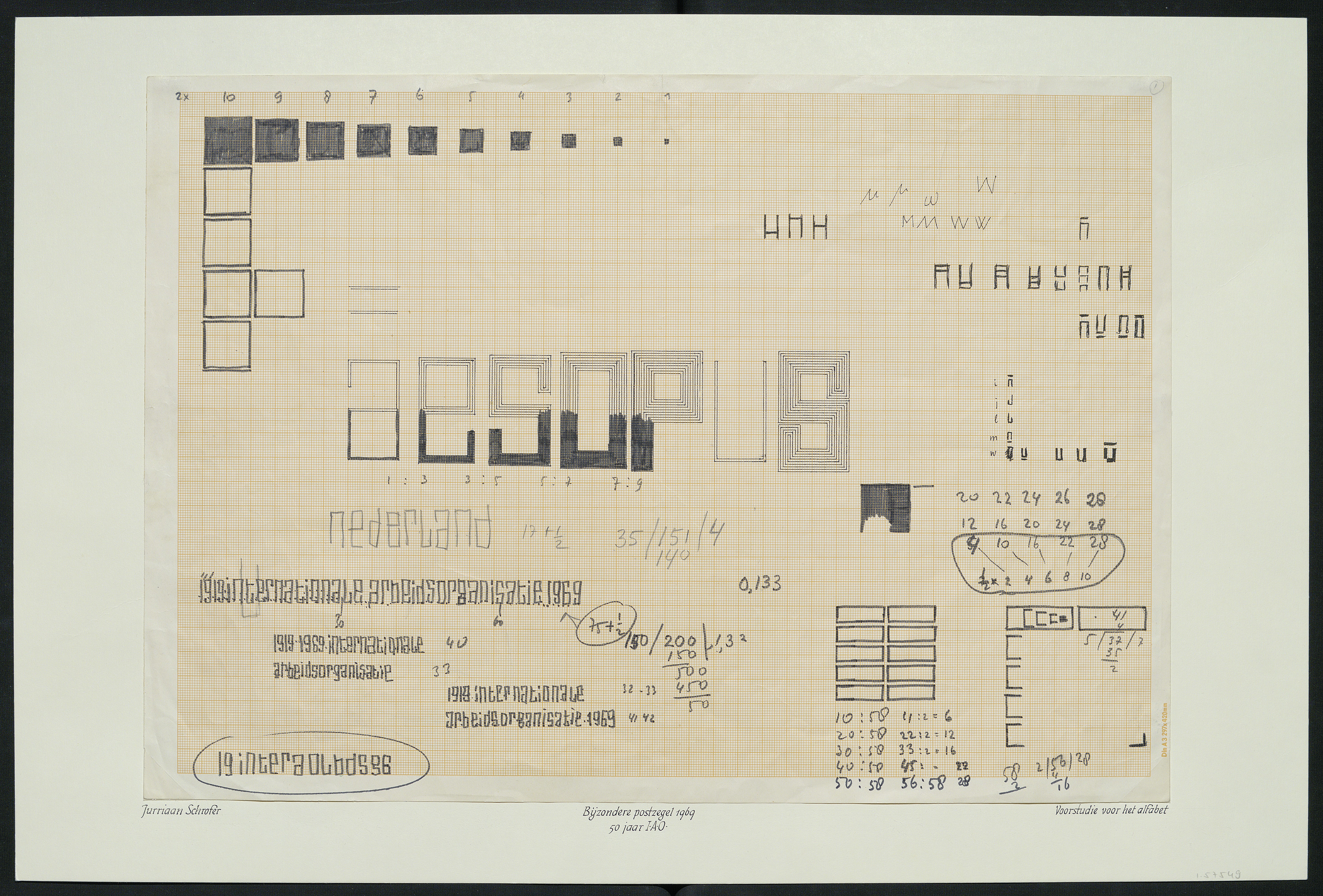
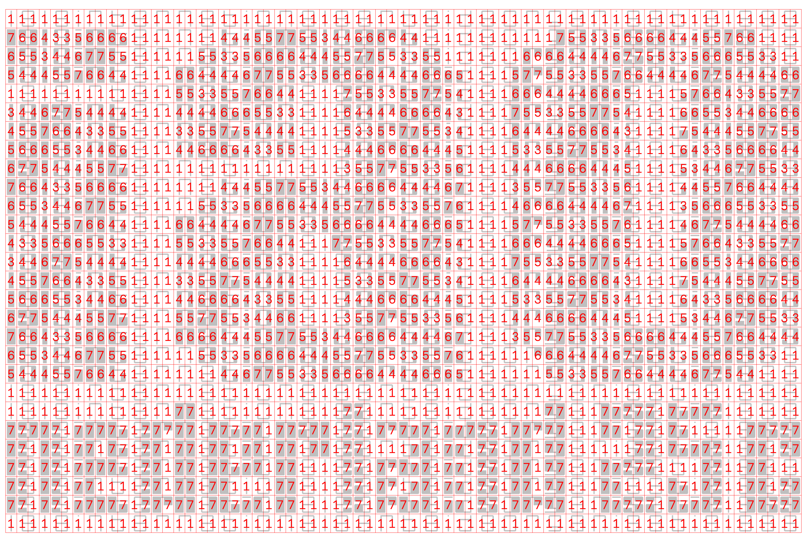
The 71 vertical strokes in the text ‘1919 Internationale Arbeidsorganisatie 1969’ defined the number of width units in the element letter grid. The two sizes of rasterized letters would have 11- and 2-unit vertical strokes, and 4- and 1-unit vertical counters.
(Nationaal Archief Nederlands)
Schrofer chose 3- and 1-unit horizontal strokes, and 5- and 1-unit horizontal counters, for the two sizes of letters. Leaving two units of space between the lines, and one unit above and below the text, gave the number of height units of the element letter grid: 28.
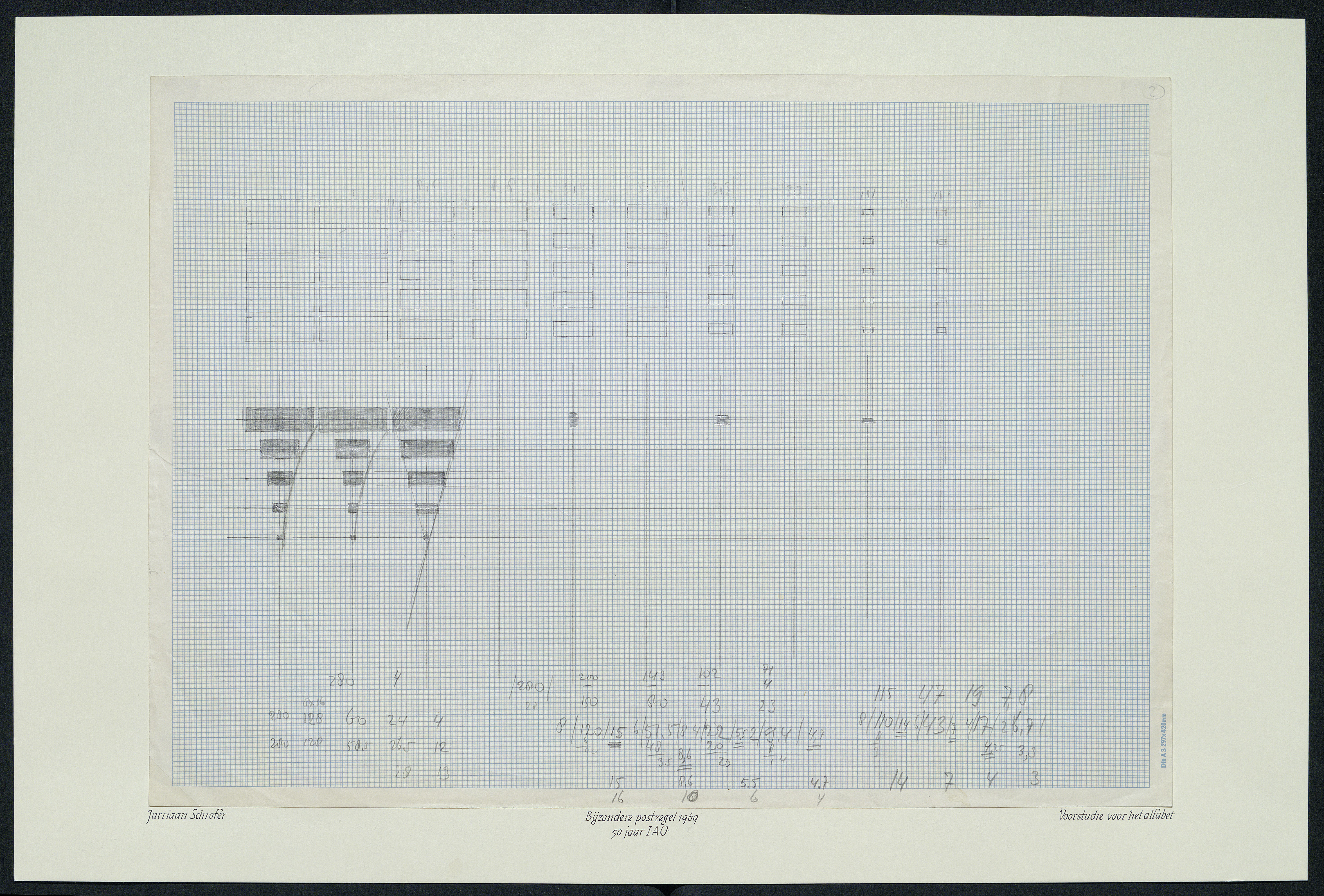
In these images Schrofer is experimenting with a couple different methods of varying the width of the vertical strokes of the element letters.
(Nationaal Archief Nederlands)
The method he chose was based on a series of whole-number vertical/horizontal stroke ratios: 1:1, 2:1, 3:1 … 7:1. Also, since the columns of the element letter grid were based on the letters’ vertical strokes, centered on constant heartlines. He drew the glyphs in a constant horizontal space sized to ensure that the sidebearings of the glyphs were always half the vertical counterspaces, at all weights.
(Nationaal Archief Nederlands)
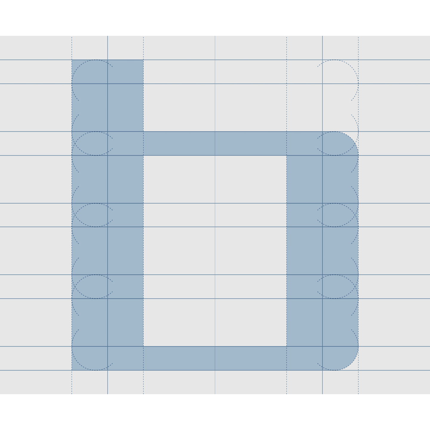

Single-vertical-stroke glyphs would simply occupy one instead of two cells horizontally, but function seamlessly with the two-stroke glyphs.
The simplest method of using weight for contrast to make the larger letters would have been a binary thick/thin treatment. But Schrofer wanted to use his weights to make more complex larger letters, as we can see in these sketches.

(Jurriaan Schrofer Archive, Allard Pierson, University of Amsterdam)
(Nationaal Archief Nederlands)
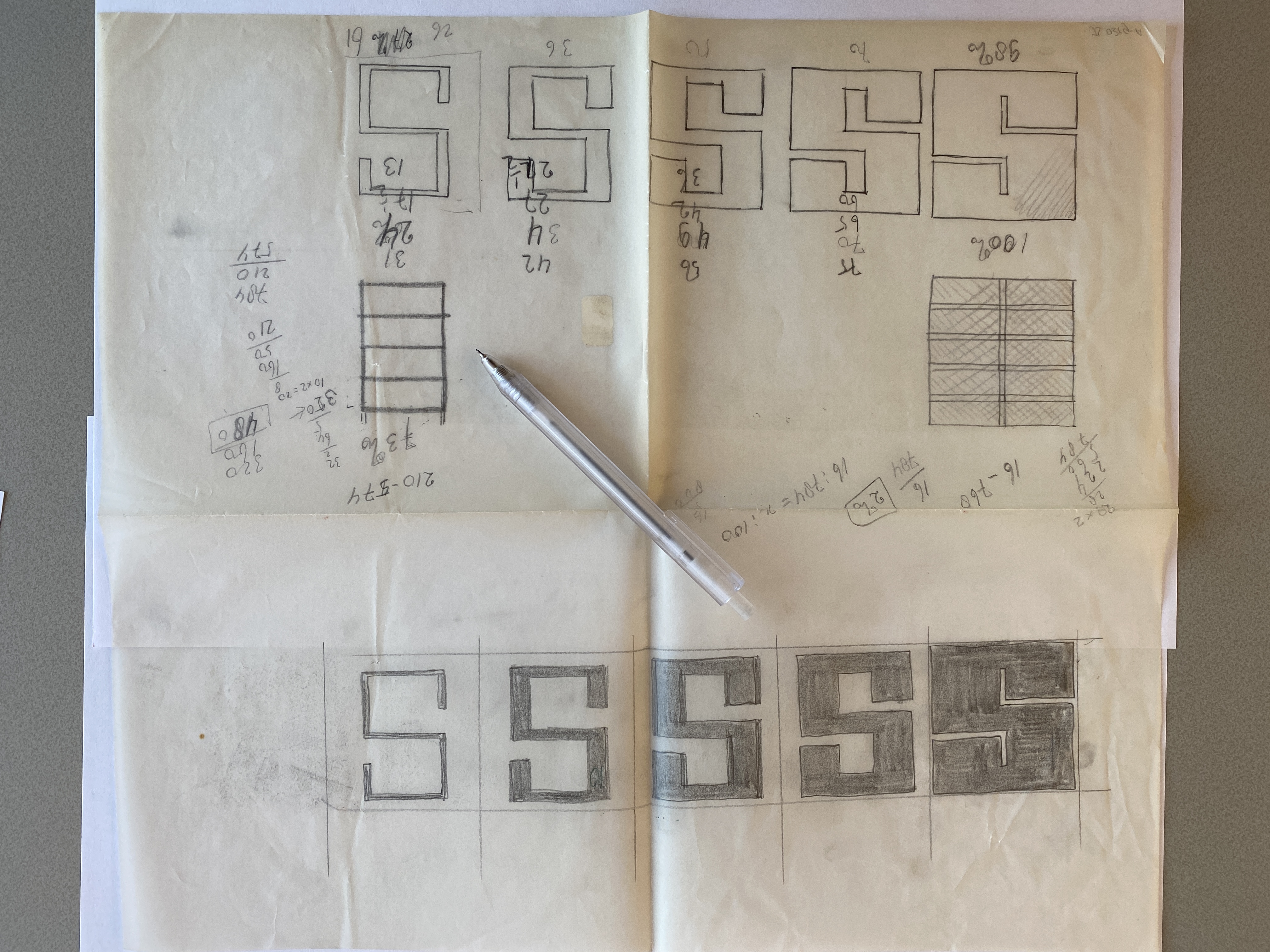
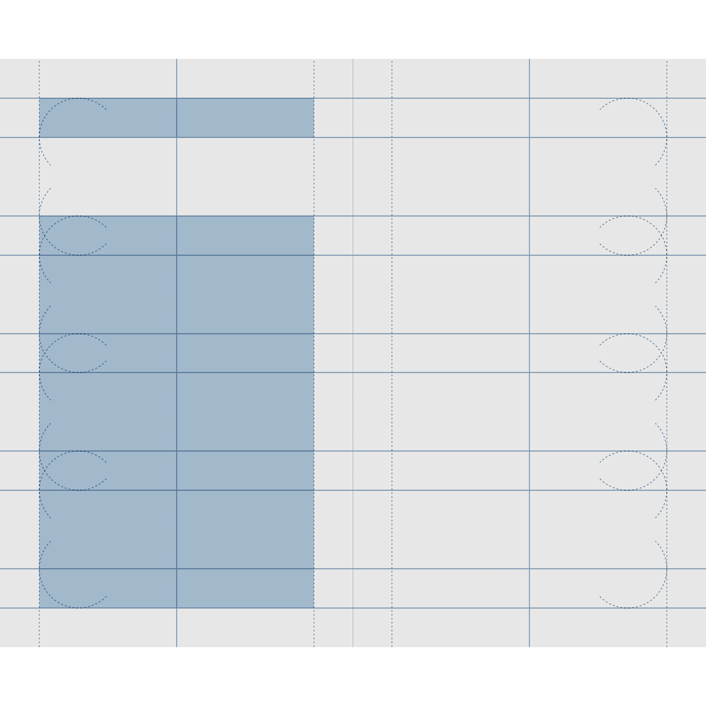
Schrofer ultimately chose a diagonally-offset weight modulation for the larger letters, oscillating from the heaviest vertical:horizontal stroke ratio, 7:1, to the third-lightest, 3:1. Here again, the 25c stamp, where the wave-like pattern is clear.
(Jurriaan Schrofer Archive, Allard Pierson, University of Amsterdam)
With the lightest 1:1 weight for the background letters, omitting the second-lightest weight would maintain contrast between figure and ground for the larger letters, no matter at what point any given cell defining those letters was in the cycle.
In the rectangular grid Schrofer had set up, a strict plan for diagonally-offsetting the weight modulation would look something like this: starting with the heaviest weight in the leftmost column at the first row containing the larger letters: 7-6-5-4-3-4-5-6 …


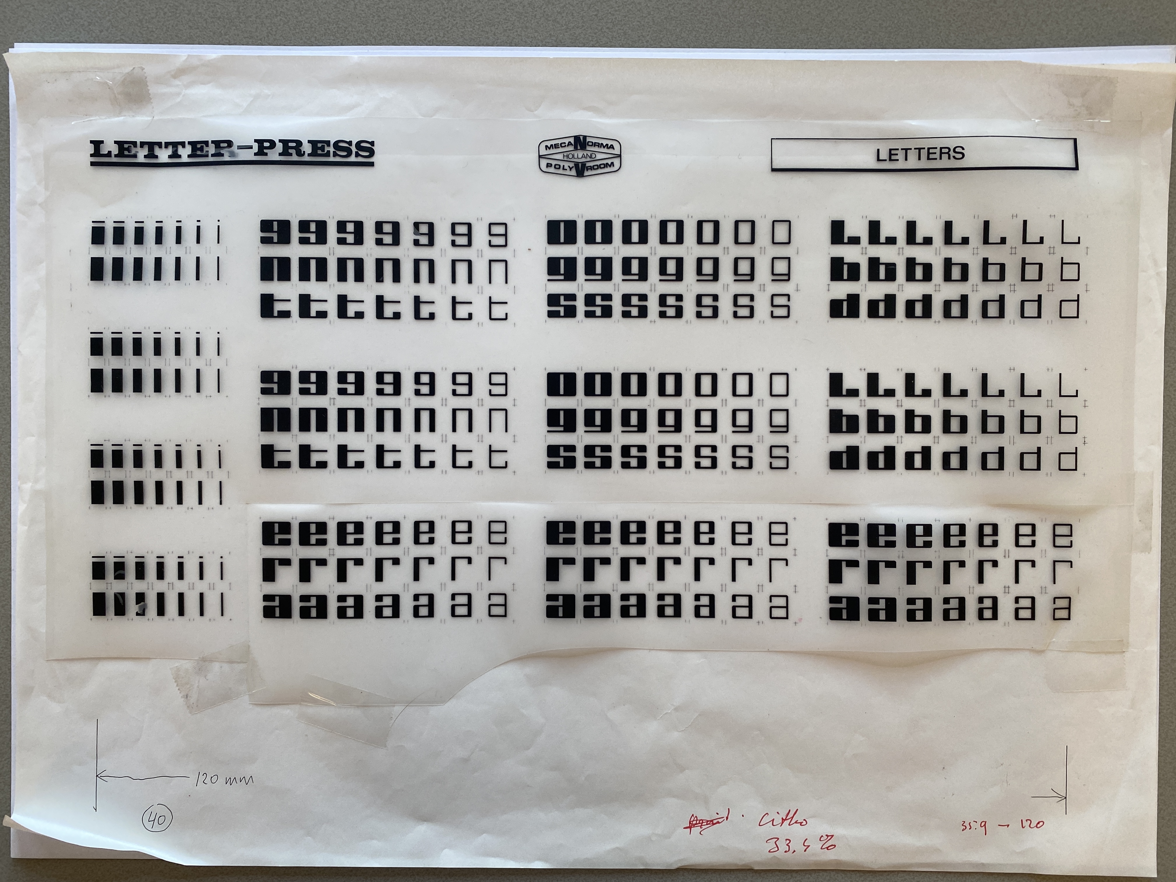
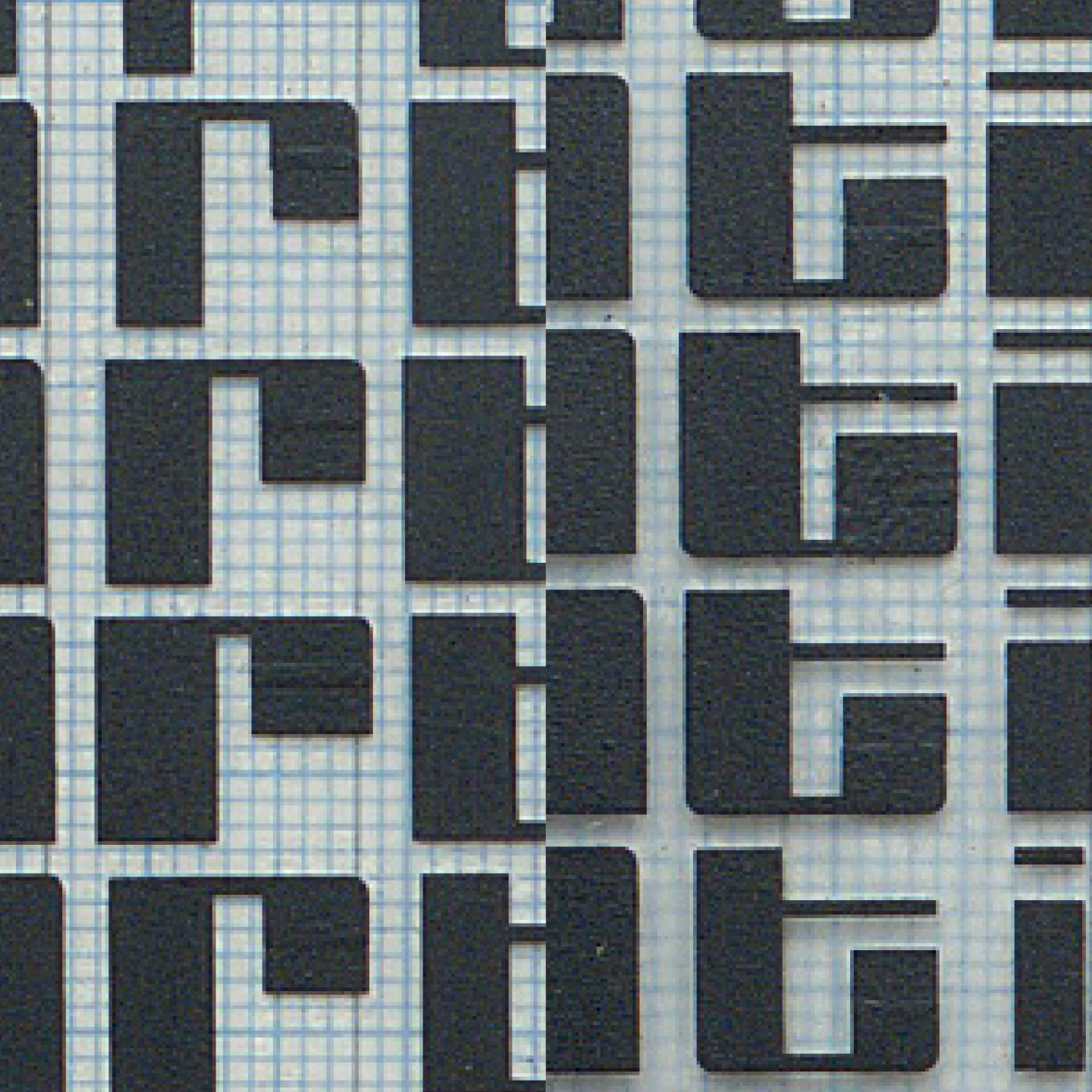
But that’s not the plan Schrofer used—understandably, if you think about it. Schrofer used custom dry-transfer lettering to make his mechanicals. He had to cut his two-stroke element letters in half vertically to create weight contrasts between one cell and the next. You can see the cuts up close.
For the stricter plan of modulation, he’d have had to cut nearly all of the element letters making up the larger letters in half—only the single-vertical-stroke letters and the two-stroke letters in the background wouldn’t need this editing. With 1349 cells in the area of the field where the larger letters are, that’s a lot of careful cutting—and evidence from his papers suggests that he didn’t have assistants he could hand the work off to. (For reference: Schrofer drew the letters on 1mm graph paper, in design spaces 36mm × 34mm, and had the drawings photographically reduced to 1/3 scale, or 8.67mm high, to produce the rubdown lettering.)
So Schrofer chose to keep the weight constant in any given glyph, except when transitioning from large-letter figure to ground or vice-versa. He could have done this while shifting to the weight the strict plan would have indicated with every new glyph. That would have looked like this: again in row 2, 7-6-6-4-3-3-5-6-6-6-6-1-1 …


But as you can see even at the start of that second row, this would have interfered with the appearance of the weight shifts, freezing the modulation in places and somewhat reducing/complicating the overall effect. The interference is subtle, but it’s there.
So Schrofer decided to ignore the strict approach, and modulate weight in the rows by glyph. That looks like this: yet again in row 2, 7-6-6-5-4-4-3-4-4-5-5-1-1, effectively turning the diagonal of the wave clockwise.


Assuming that Schrofer adjusted the weight modulation plan at least in part to reduce the amount of work he had to do, here’s something curious. Look again at Schrofer’s drawings for the glyphs and the produced rubdown letters.
(Nationaal Archief Nederlands)
(Jurriaan Schrofer Archive, Allard Pierson, University of Amsterdam)
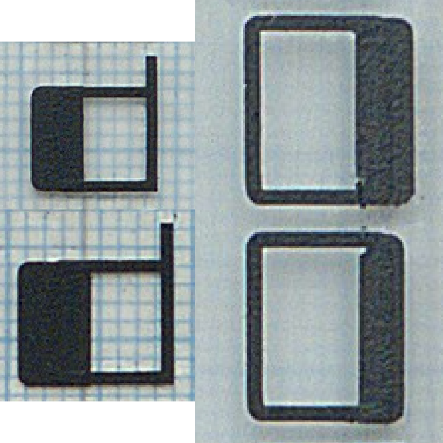
In Schrofer’s drawings and on the sheet of dry-transfer letters, the L/l has the form of a majuscule Latin alphabet L and the width of two vertical strokes. But if you look carefully, you’ll notice that unlike other glyphs with an implied curved stroke, like the bottom of the T/t and the 9 or the arm of the R/r, the corners of the bottom of the L/l are unrounded. Also, the ‘outstroke’ of the T/t and the shoulder of the R/r extend only about one-quarter of the height of the letter.
Now look at those same glyphs in the mechanical:
(Nationaal Archief Nederlands)
Here the L/l is a single vertical stroke, identical to the 1. Indeed it would have to be, in order for the full line of background text to fit in 71 cells at one vertical stroke per cell.
Also, the heavier weights of the T/t and R/r have extended strokes. Manually extended; you can see the seams where Schrofer overlaid pieces of lettering to create them.
And not perfectly consistently; there are mistakes that made their way onto the stamps. Notice the third and fourth T/ts from the top of the column:

Schrofer’s goal was apparently to make the background element letters as light as possible, and the element letters for the larger letters as heavy as possible, to reinforce the weight contrast between them.
At first I wondered if the extra L/l glyphs were there for material to add to the T/t and the R/r. But if Schrofer knew in advance he’d need those longer strokes, it’d have been much more efficient to design all but their lightest weights with longer outstrokes. I think he discovered while making the mechanical that he needed the longer strokes for the heavier weights of the T/t and R/r. It was fortunate he had the material to make them, but even if this is what happened, the question of why he had the two-stroke L/l made in the first place remains unanswered.
Here’s another curious thing: Consider that the designs for the 25c and the 45c stamp are identical, except for the 2/4.
(Nationaal Archief Nederlands)
As I noted above, the weight adjustment mistakes with the T/ts appear on both stamps, which suggests they used the same mechanical. Now look again at the mechanical (the only one in the archives):
(Nationaal Archief Nederlands)
The transfer letters were rubbed down on loose mylar/acetate taped to a piece of graph paper for alignment. It makes sense that Schrofer would have reused the mechanical and swapped the 2/4 in the field by carefully cutting one out of the sheet and replacing it with the other. There are other examples of this kind of manual/material editing in his archives.
So, why doesn’t the mechanical show this? The clear sheet is completely intact, so he didn’t cut out one number and replace it with a piece of sheet with the other. He might have made the 45c version of the field first, had it photgraphed, then carefully scraped off the rubdown letters for the 4 and replaced them with ones for the 2. But there’s also no sign of the sheet being worked with the kind of tool it would take to do that.
I hope more time in Schrofer’s archives will yield an answer.
(All uncredited digital diagrams made with Python in DrawBot.)