student work
45 Symbols
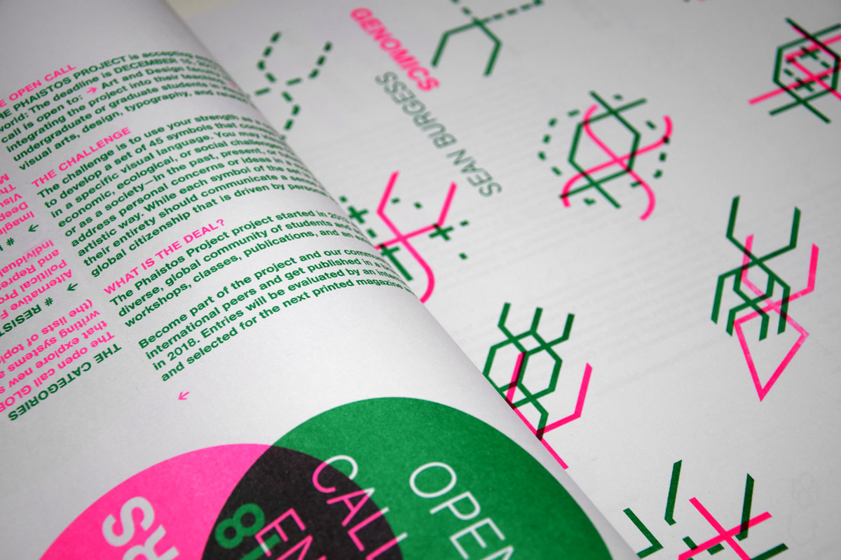
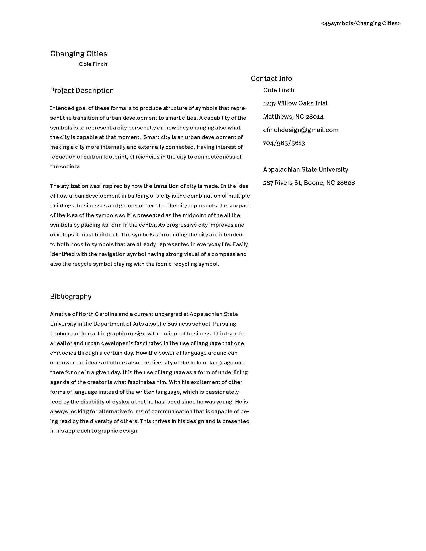
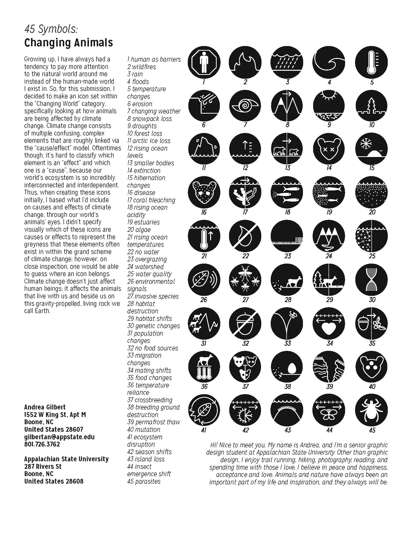
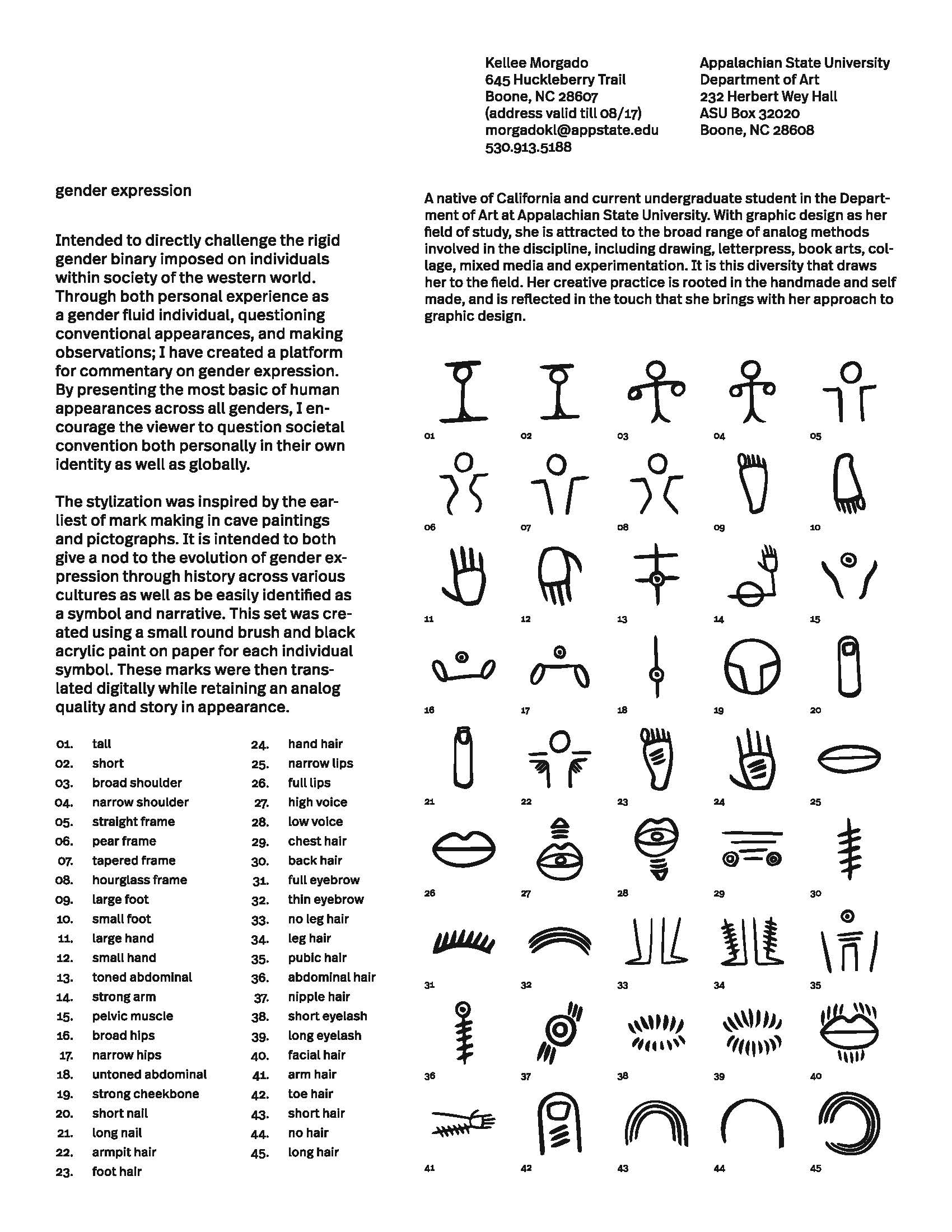
Students in my Sign, Symbol, Image course in fall 2016 submitted entries to the Phaistos Project’s annual 45 Symbols international call for entries. Entrants study a topic in response to a set of prompts and create a system of 45 symbols (the number of symbols on the Phaistos Disk) that tell a story about that topic. One of the students, Sean Burgess, was one of three winners, and his system, Genomics, was included in the Project’s documentary print publication. Three of the four special jury mentions were also students in my course: Cole Finch, Andrea Gilbert, and Kellee Morgado. All four of their projects are documented on the project’s website.
Students in my Sign, Symbol, Image course in fall 2016 submitted entries to the Phaistos Project’s annual 45 Symbols international call for entries. Entrants study a topic in response to a set of prompts and create a system of 45 symbols (the number of symbols on the Phaistos Disk) that tell a story about that topic. One of the students, Sean Burgess, was one of three winners, and his system, Genomics, was included in the Project’s documentary print publication. Three of the four special jury mentions were also students in my course: Cole Finch, Andrea Gilbert, and Kellee Morgado. All four of their projects are documented on the project’s website.




Packaging systems
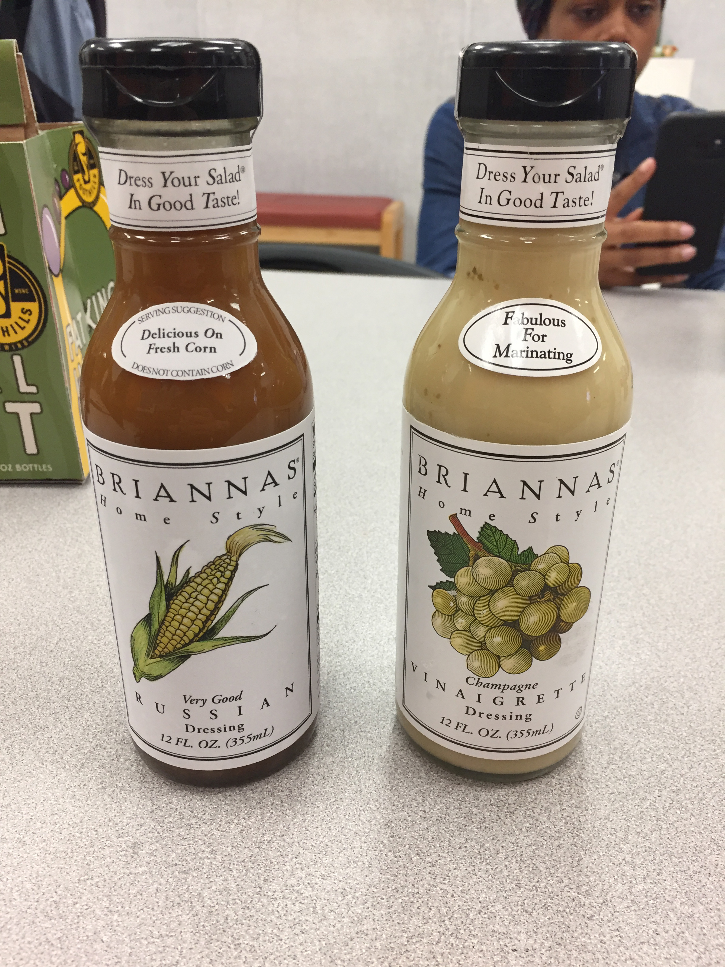
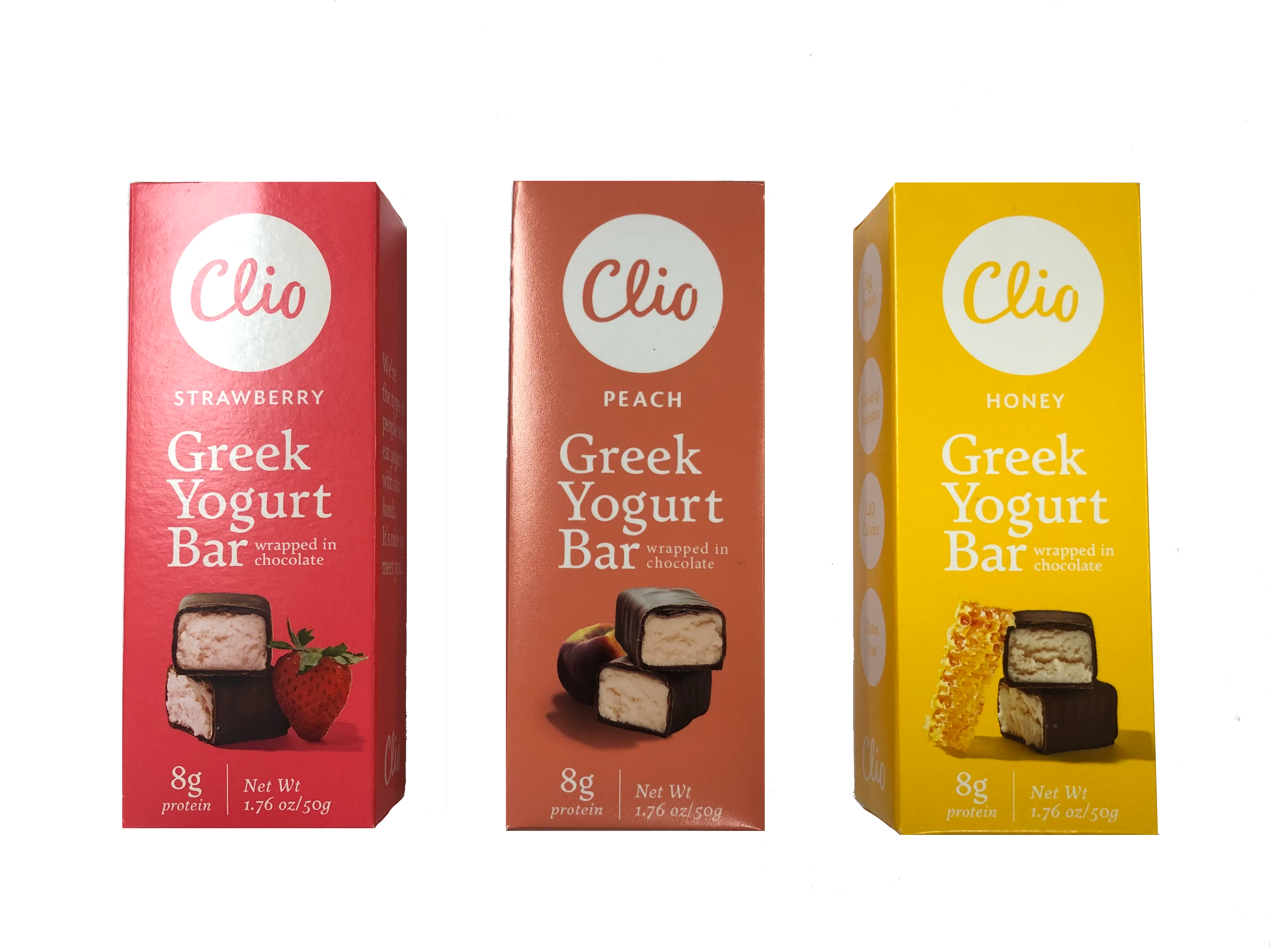
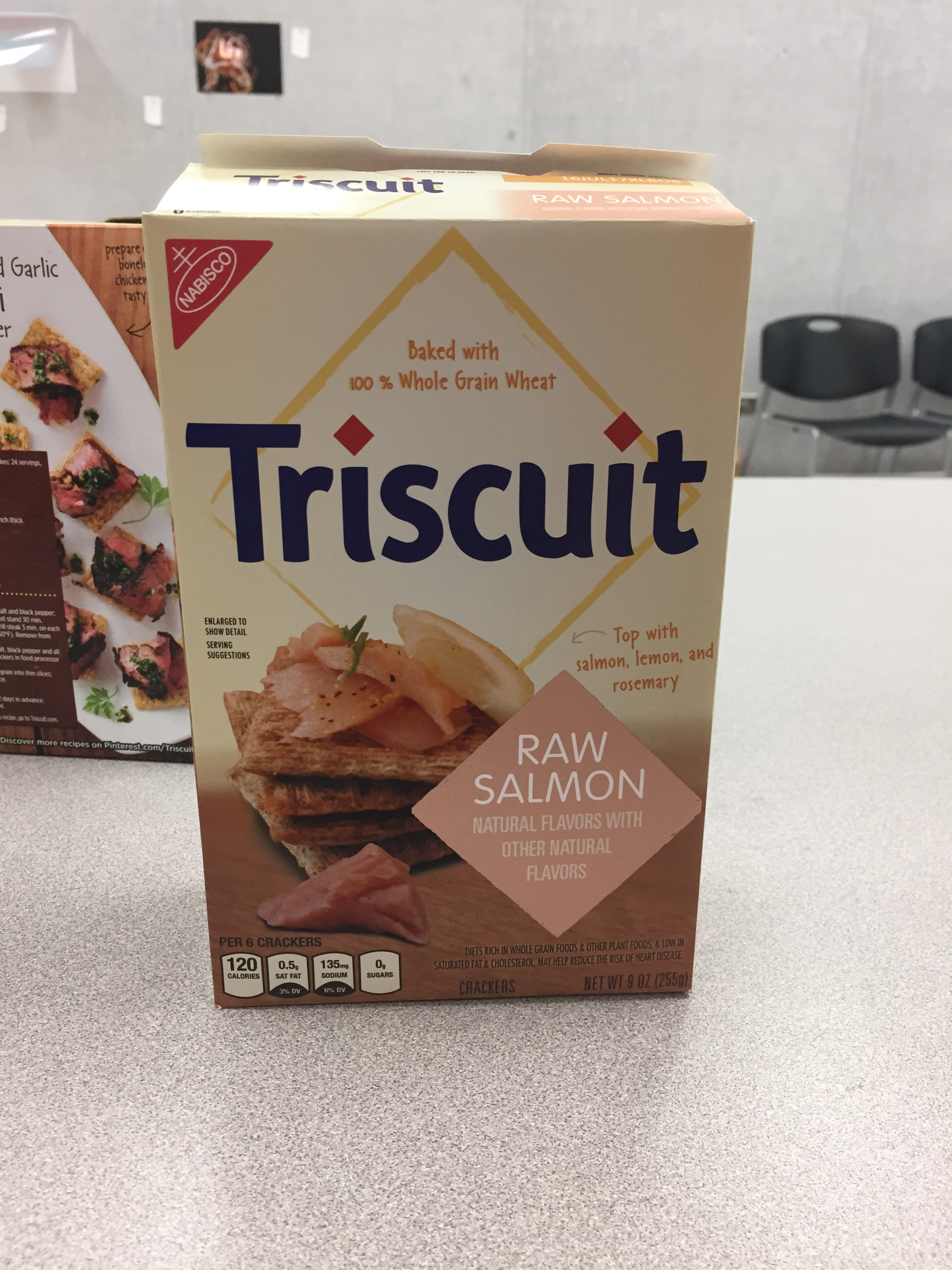
Students in intermediate typography choose a grocery store product that comes in varieties, and analyze and reconstruct its packaging system. Then they use that system to create packaging for a new variety in the series. The test is to make a package that blends in as completely as possible with the existing real varieties.



Movie posters
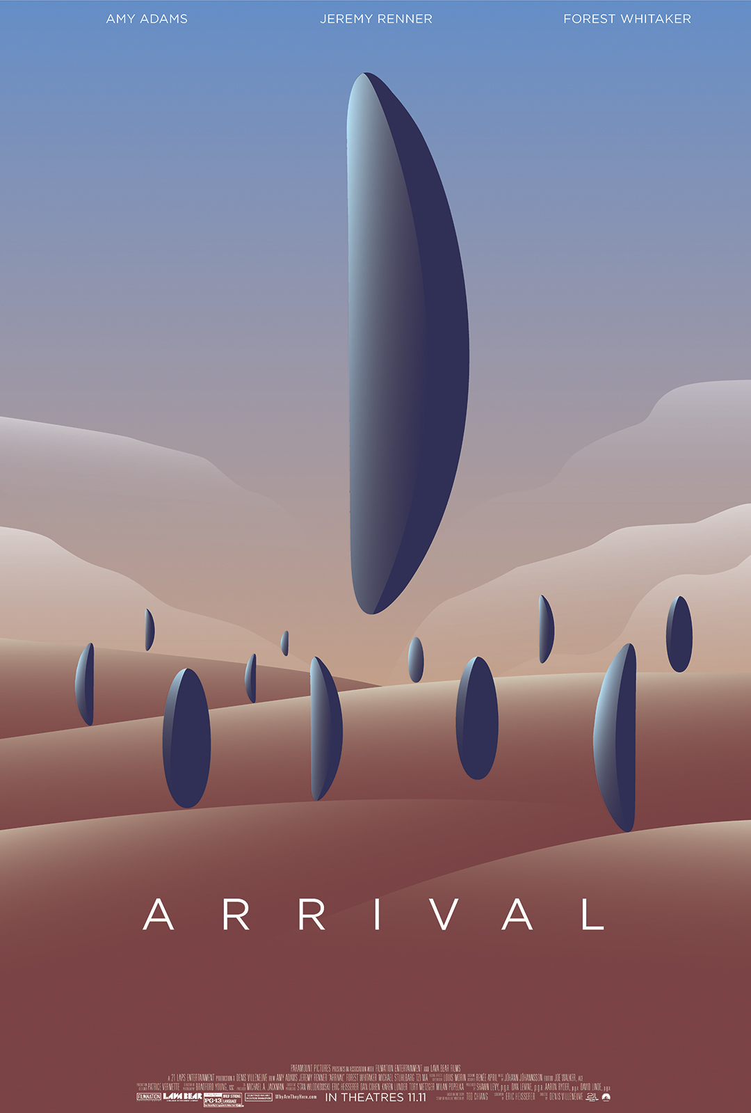
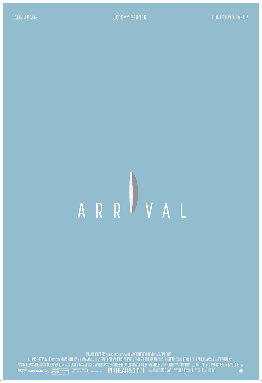
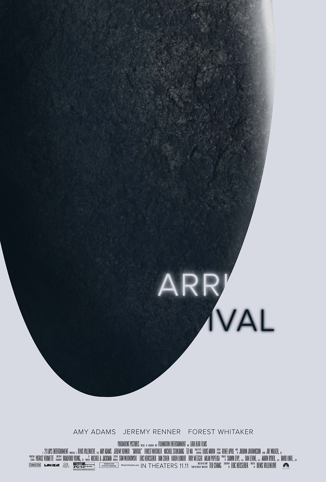
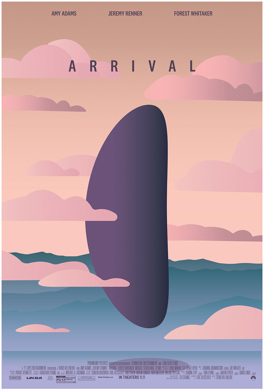
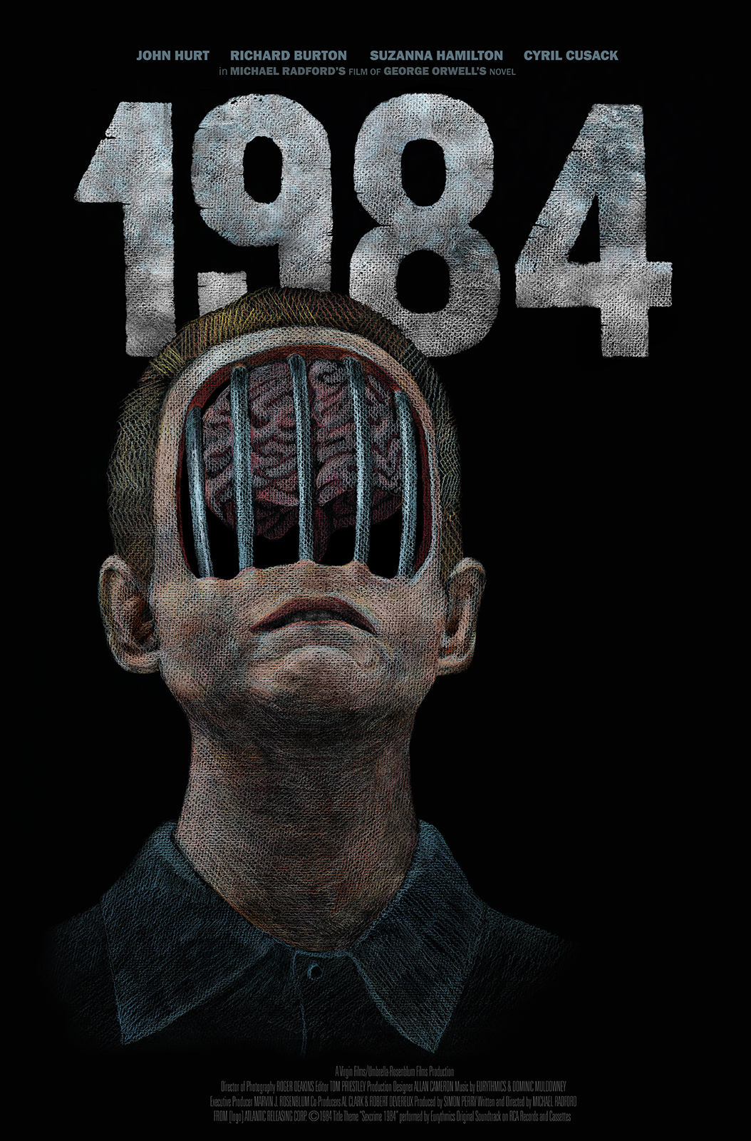
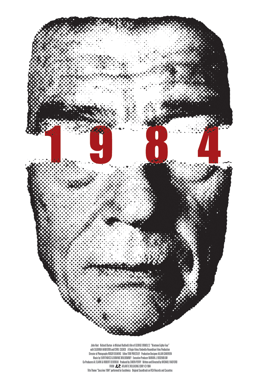
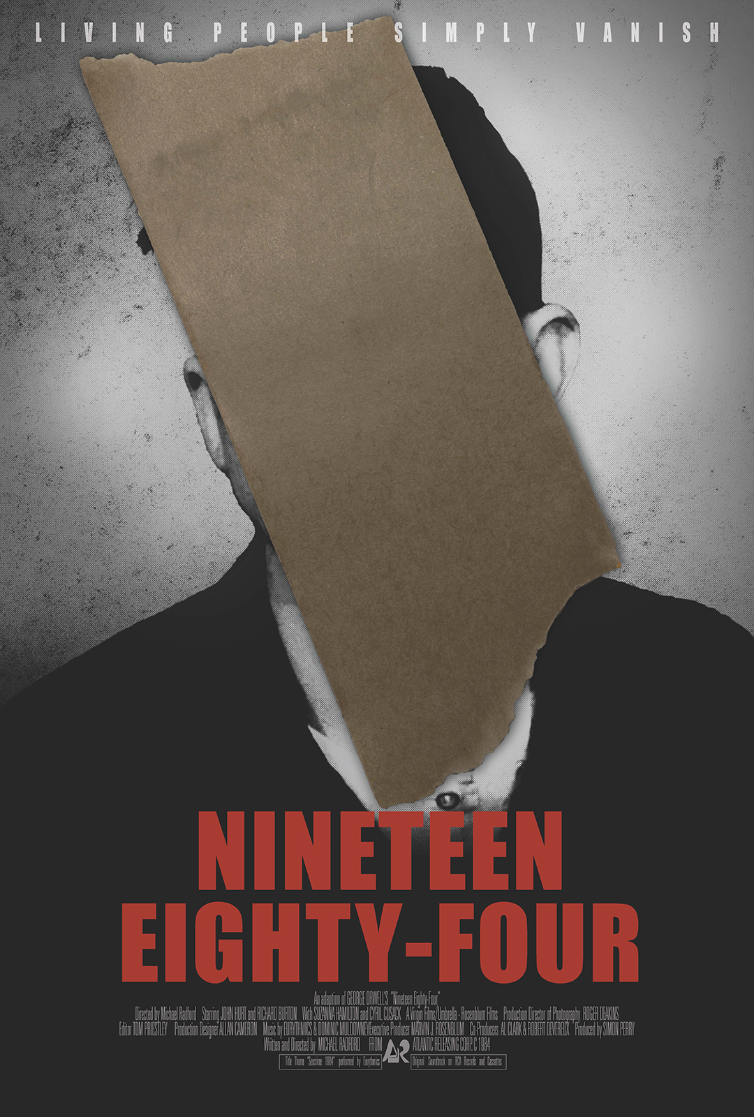
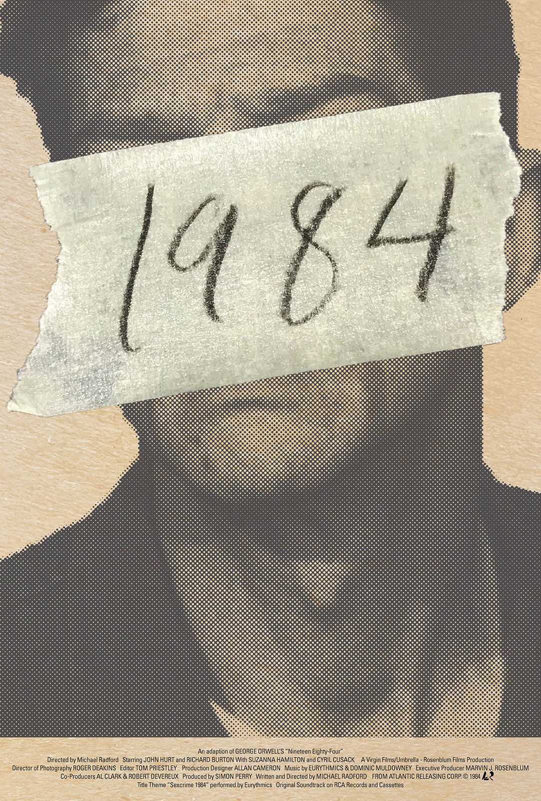
Students in intermediate typography watch a move in class and discuss its themes and ideas. They then create a one-sheet format (27 × 40in) poster for the movie, complete with billing block and logo farm, that (ideally) uses the interaction of type and image to convey a sense of the movie. This is a harder assignment than students think at first, but when the final prosters don’t work the way they’d imagined, it gives us an opportunity to talk about why it can be hard to challenge conventions and existing practices in a design genre.








Book cover and chapter
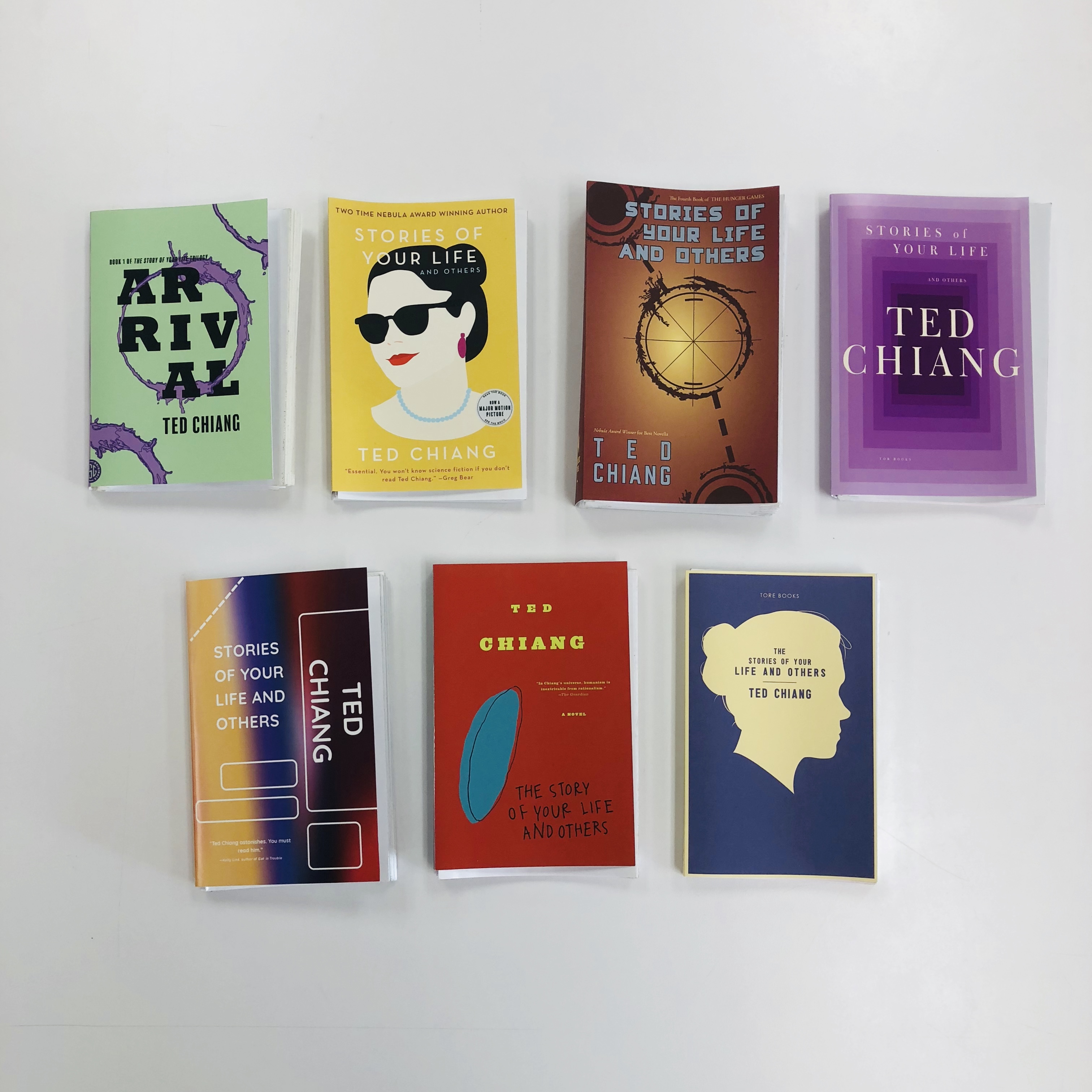
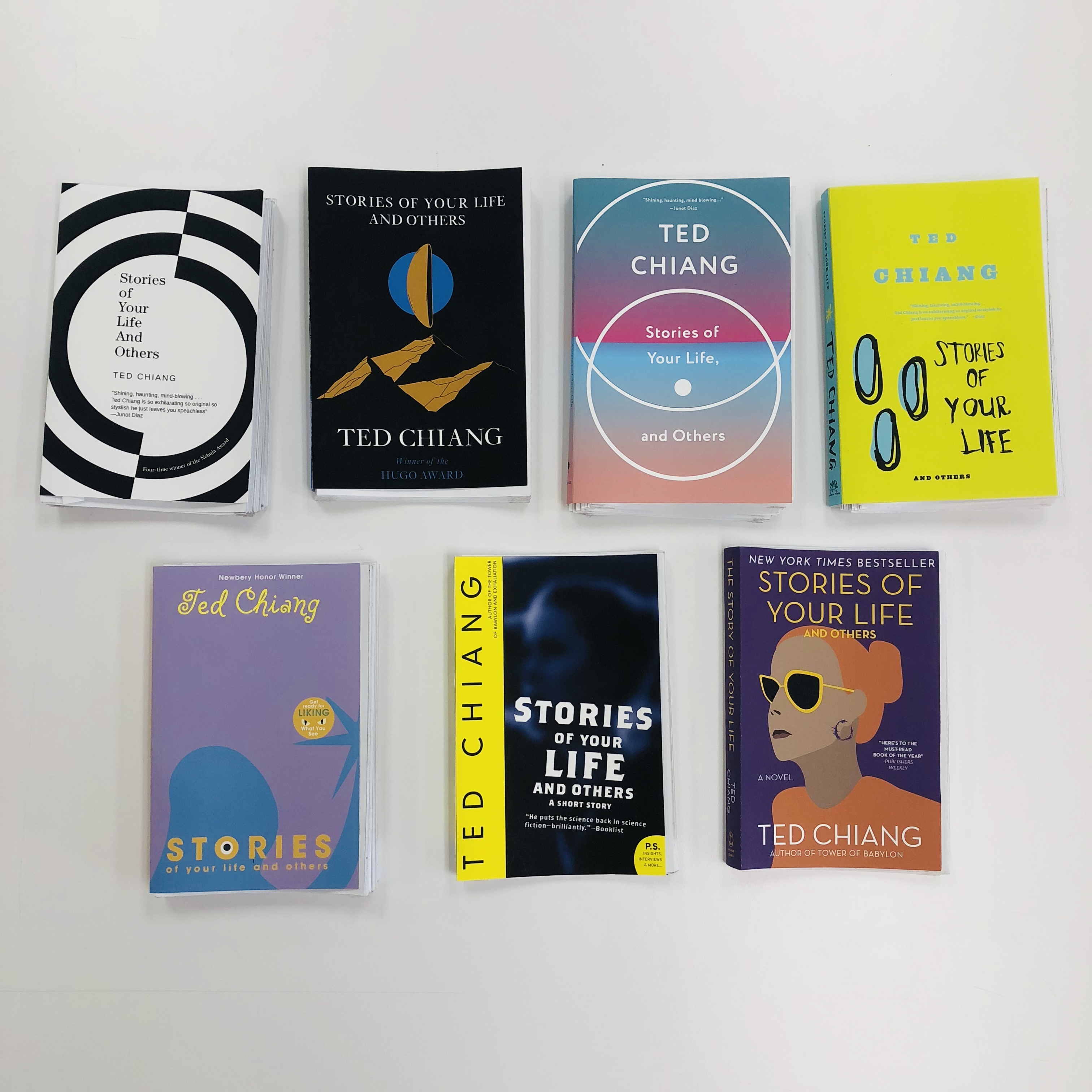
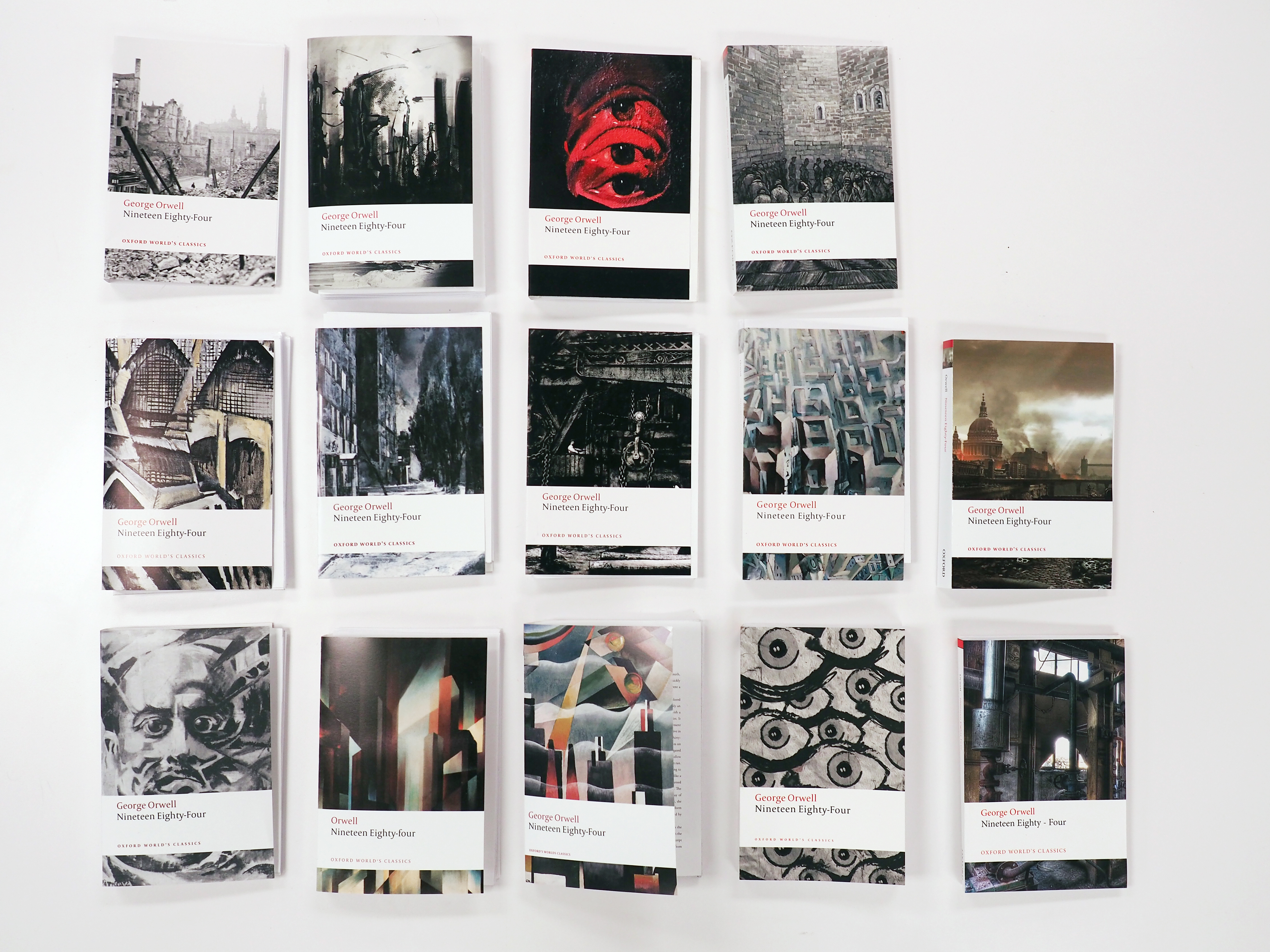
Students in intermediate typography analyze and apply an existing book cover and text block design system to a new text (or in the case of Orwell and the Penguin Marber grid, newly to that text). The system is generally a multi-author system, but a couple times I’ve allowed students to use single-author or single-series systems. This leads to useful conversations in class about the differences in approaches and goals between tailored and generalized design.


Poster pastiche
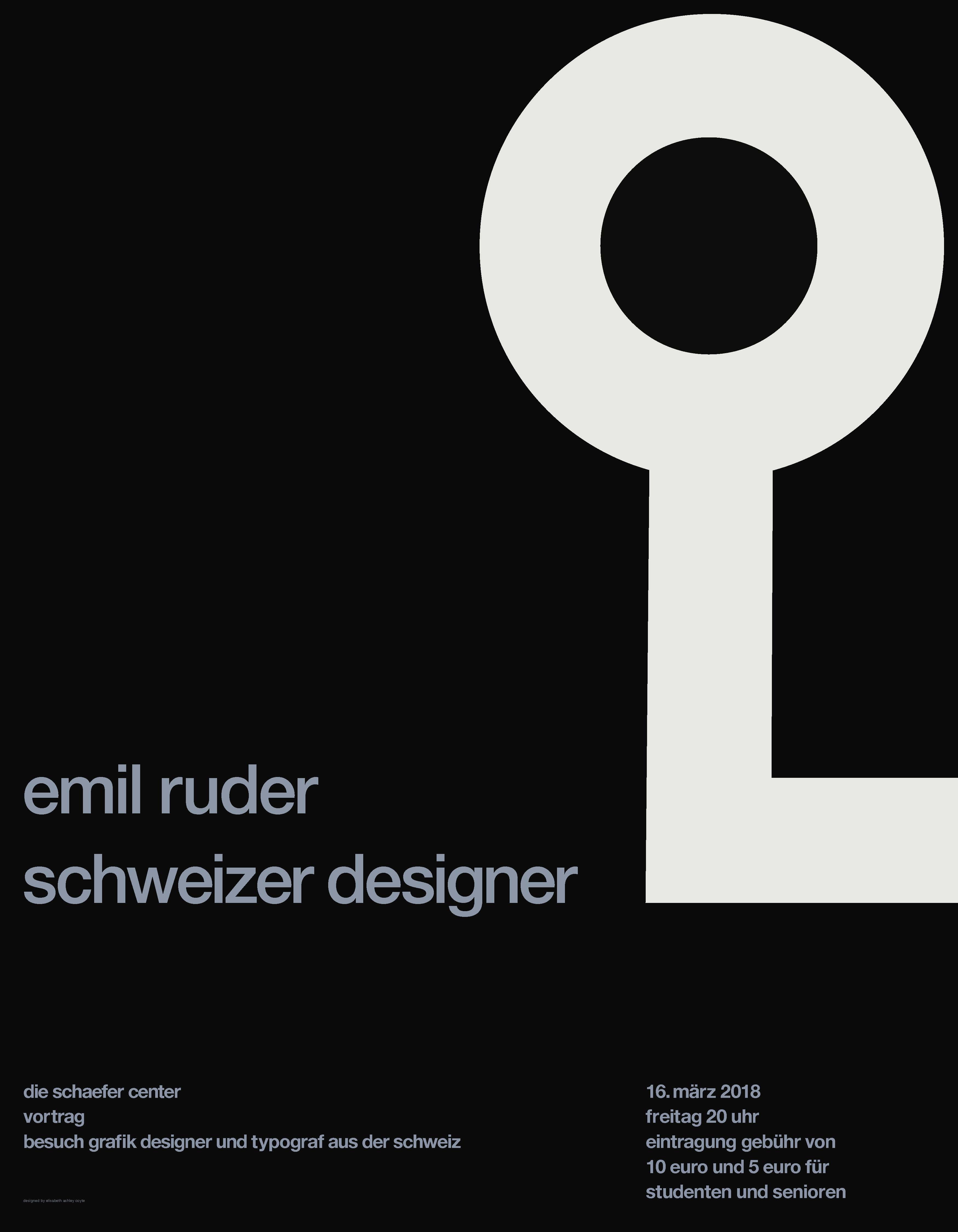
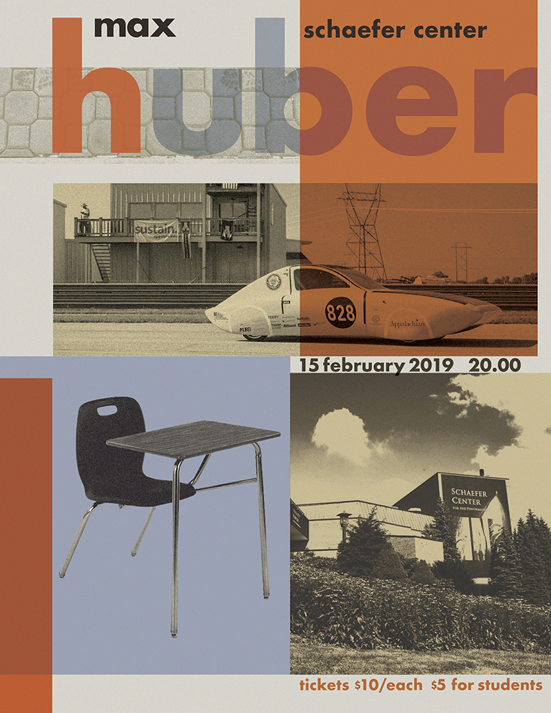
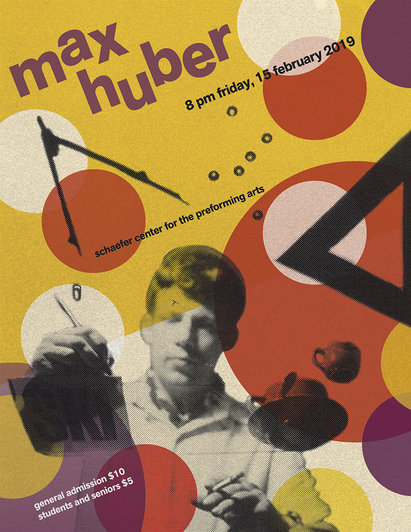
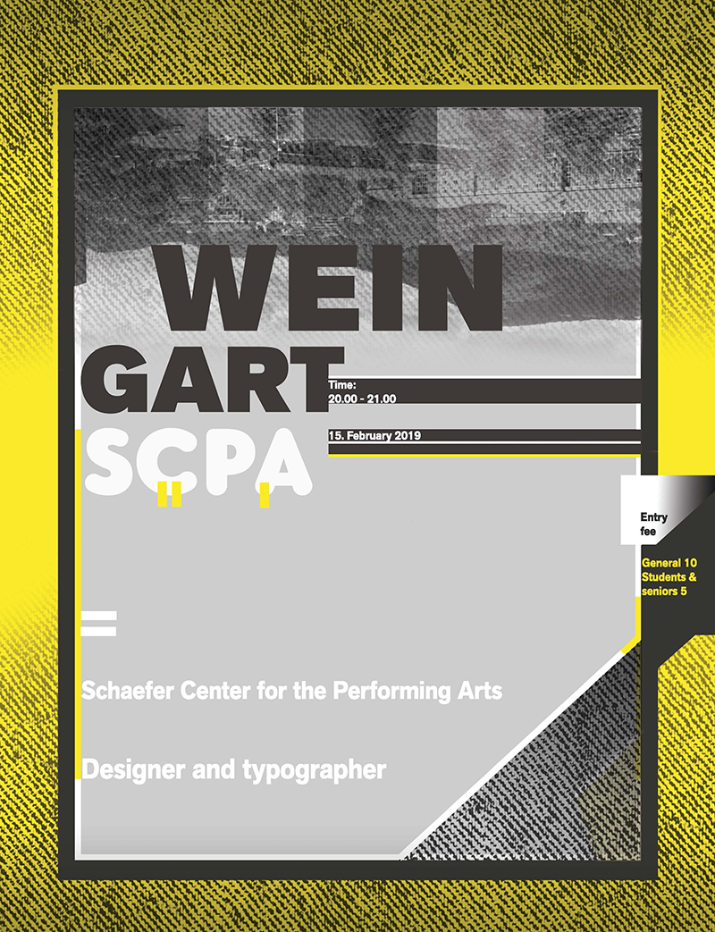
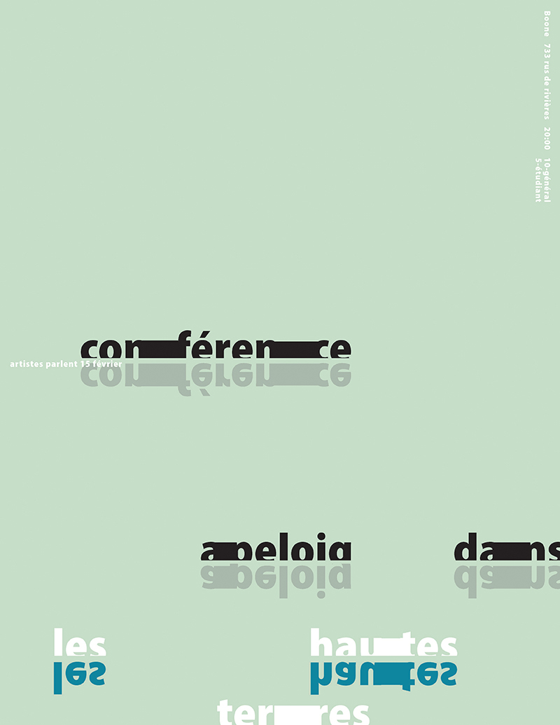
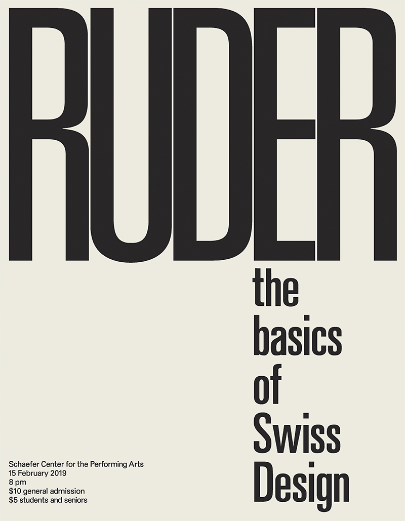
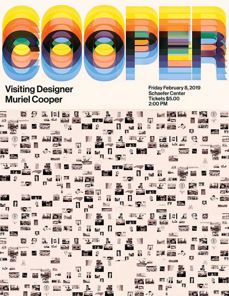
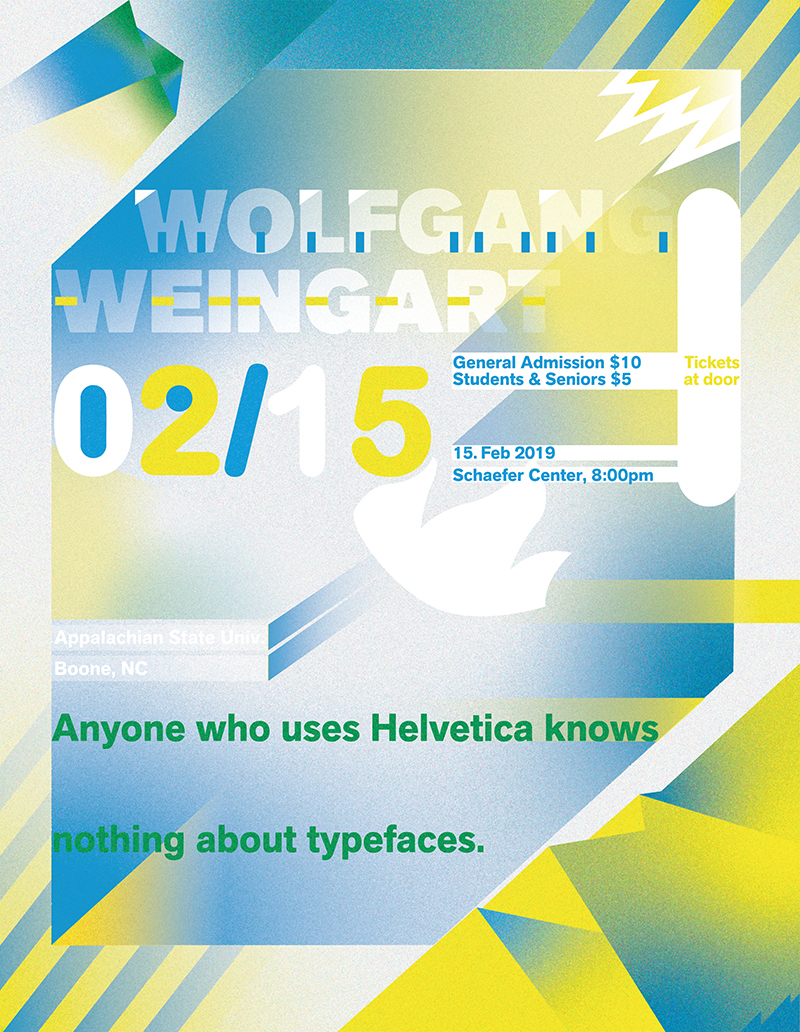
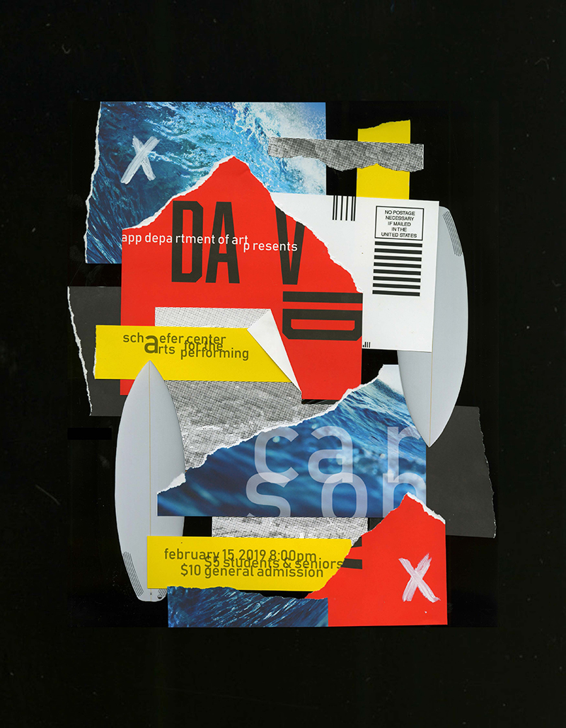
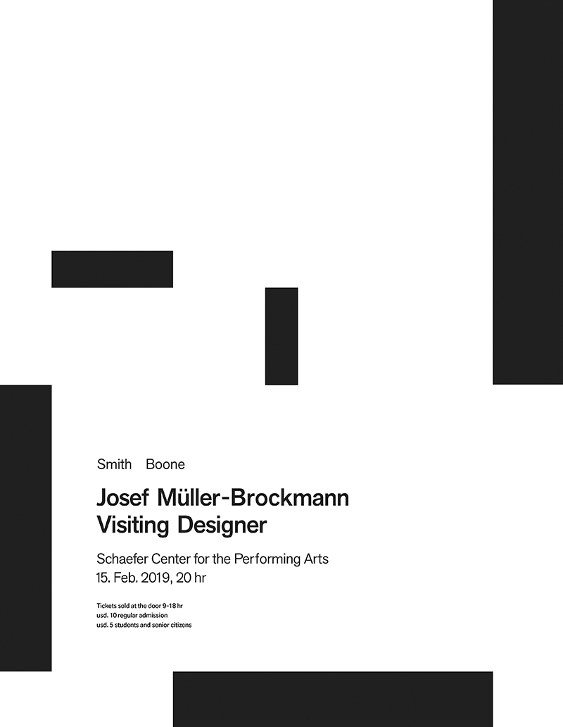
Students in intermediate typography choose a postwar designer known for their poster work and create a 17 × 22in poster announcing a visit and lecture by that designer on campus. The goal is to design the poster as a pastiche of their chosen designer’s style and approach (with special attention to the type/lettering), either modeling it after a specific example of their work or analyzing and synthesizing many examples to create a poster that looks like the designer’s own work.

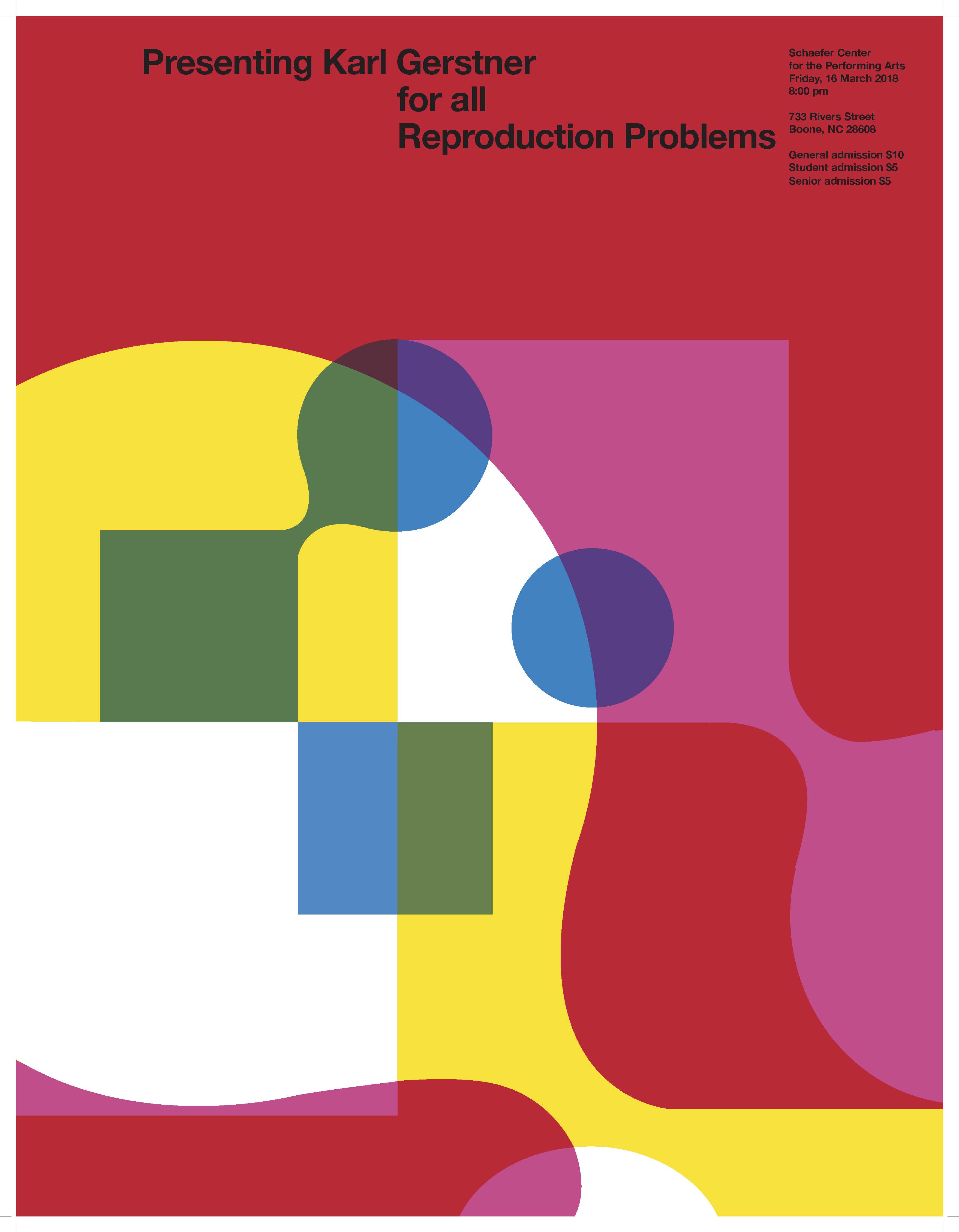
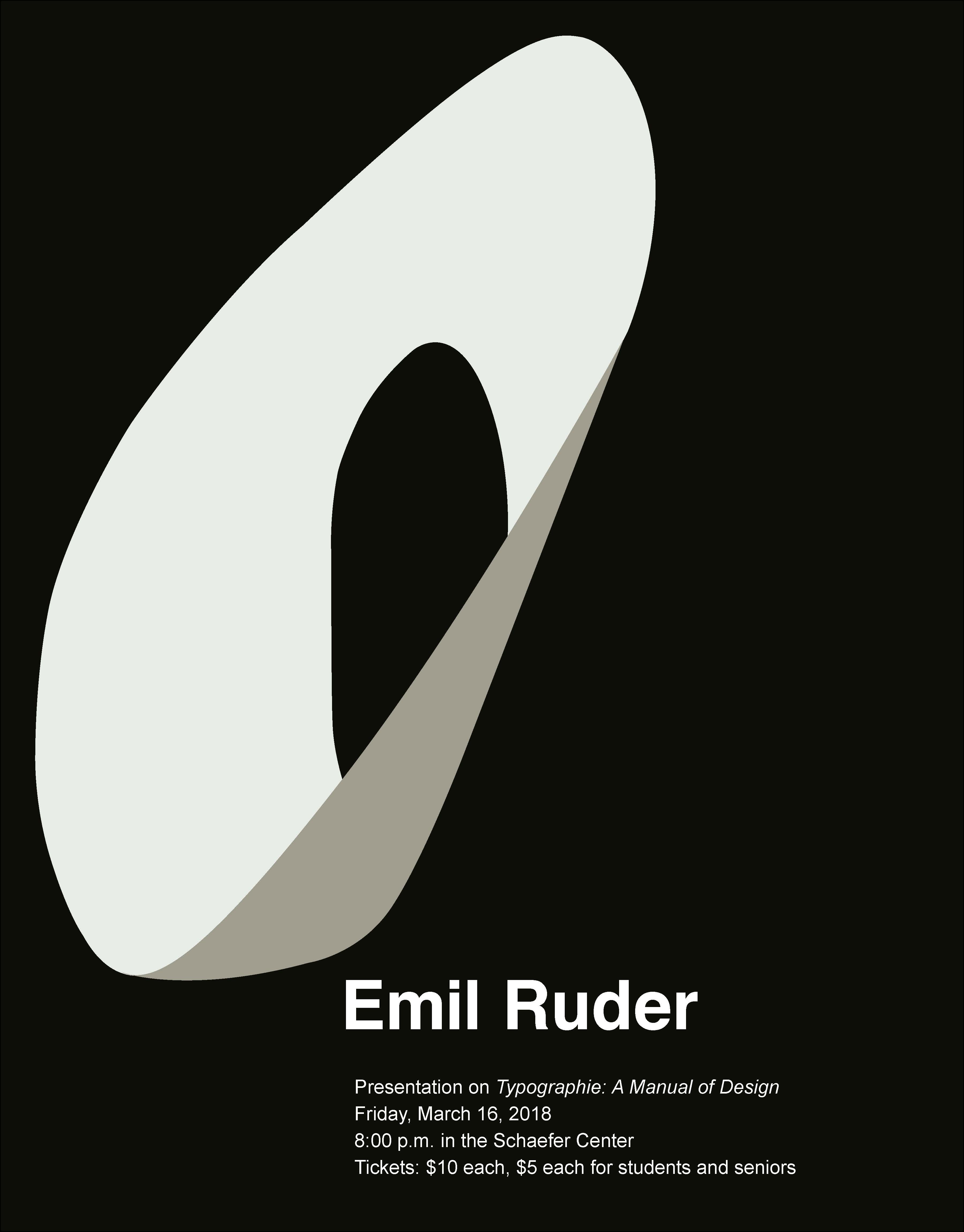
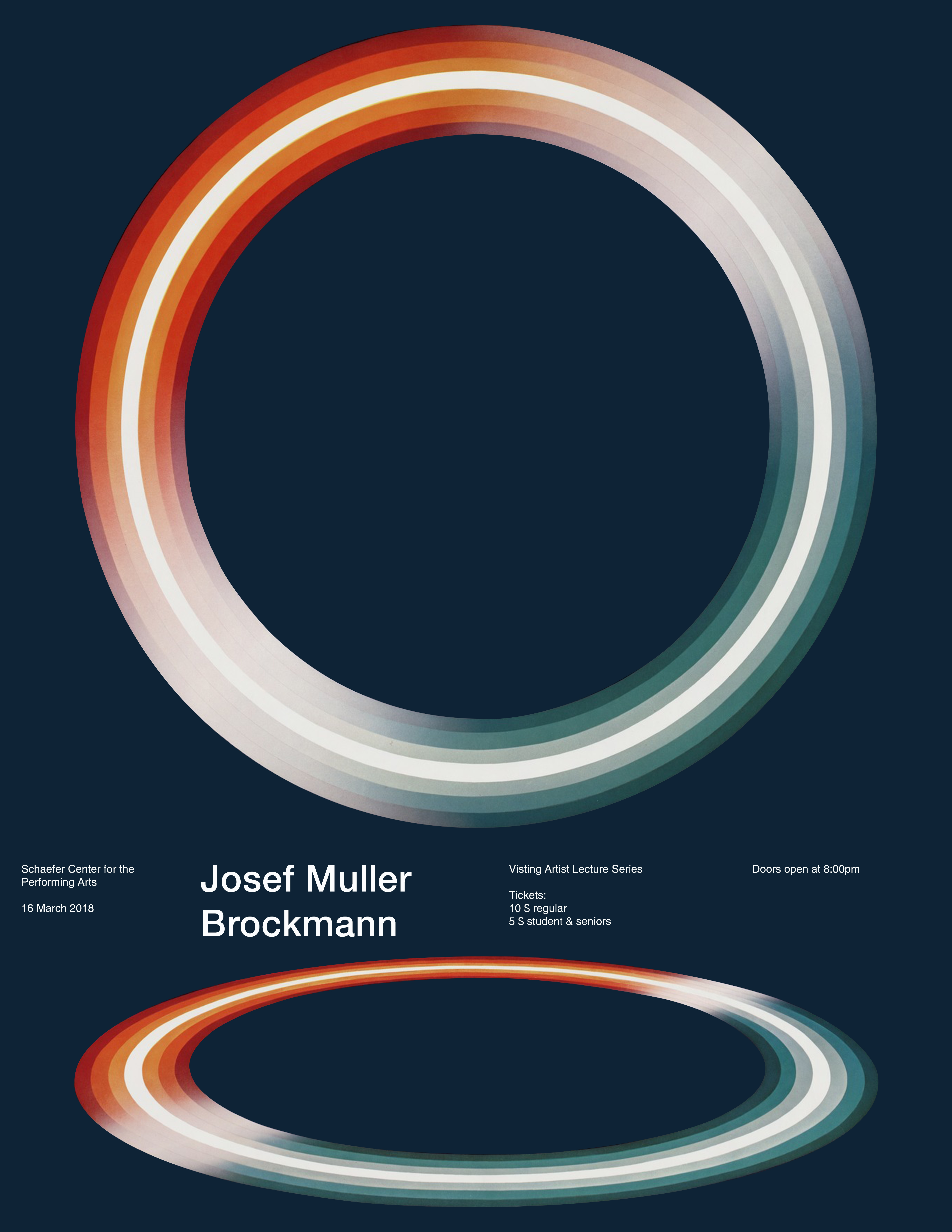
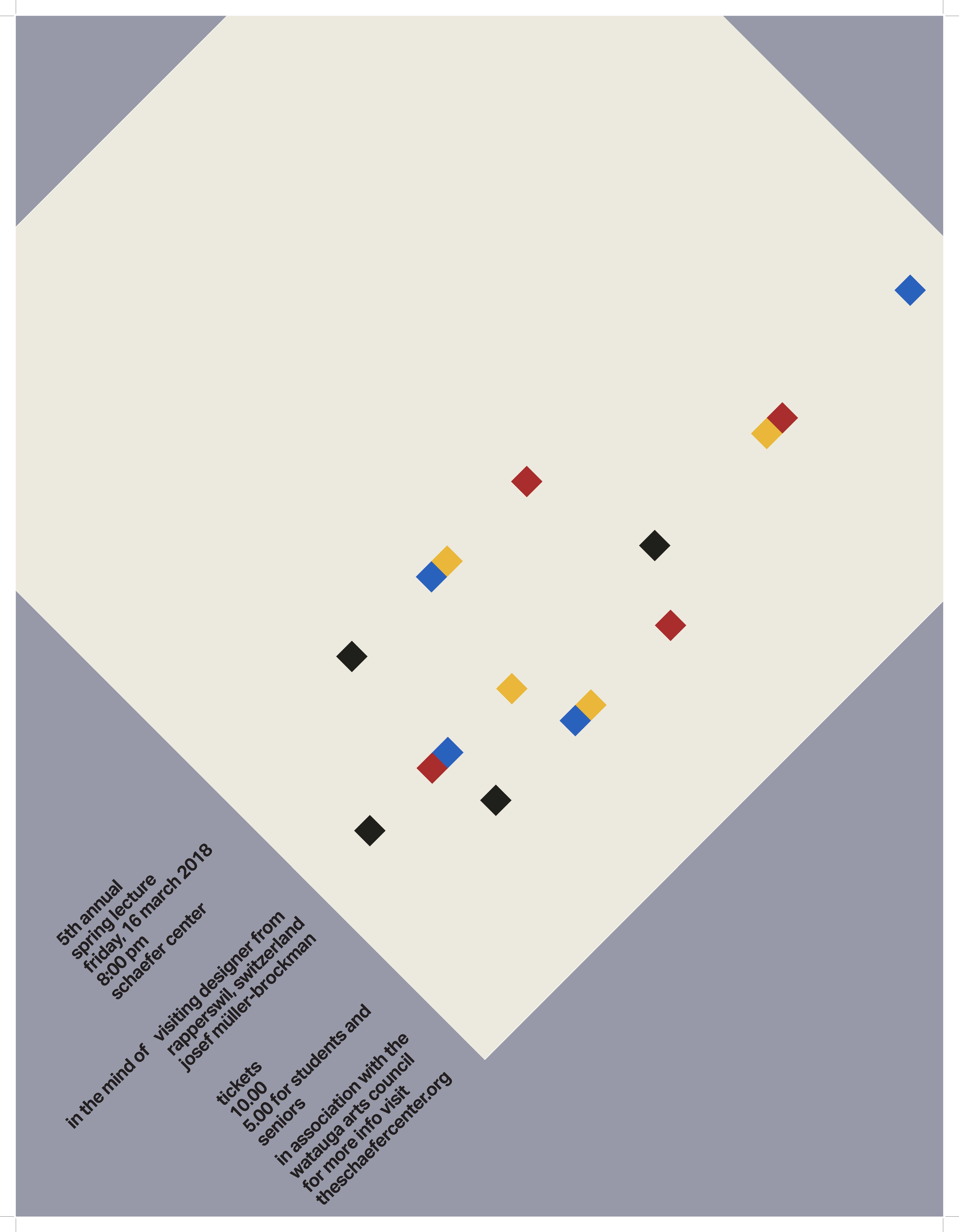






Constructed script project
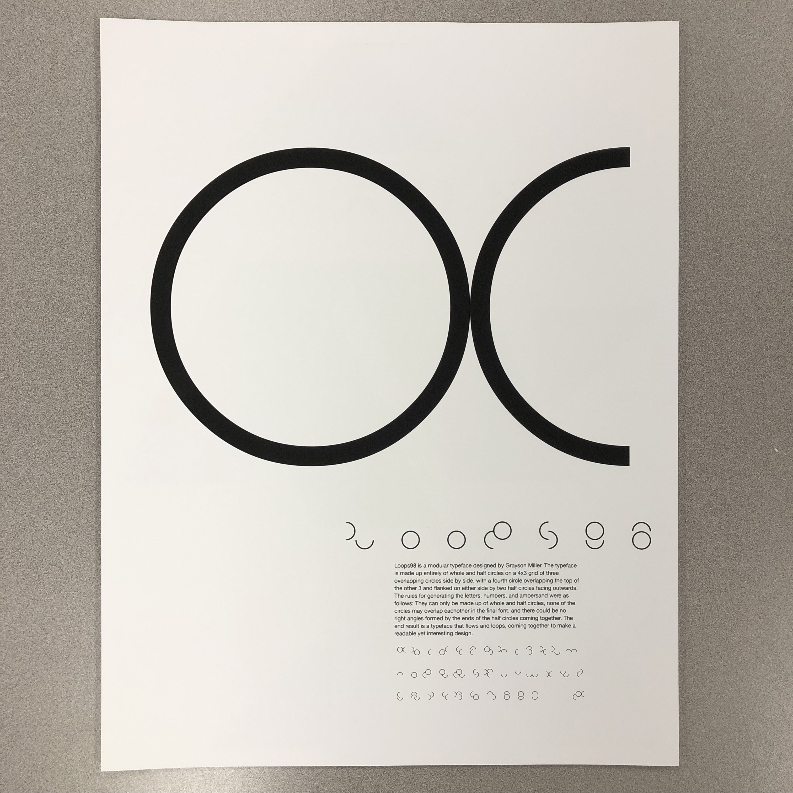
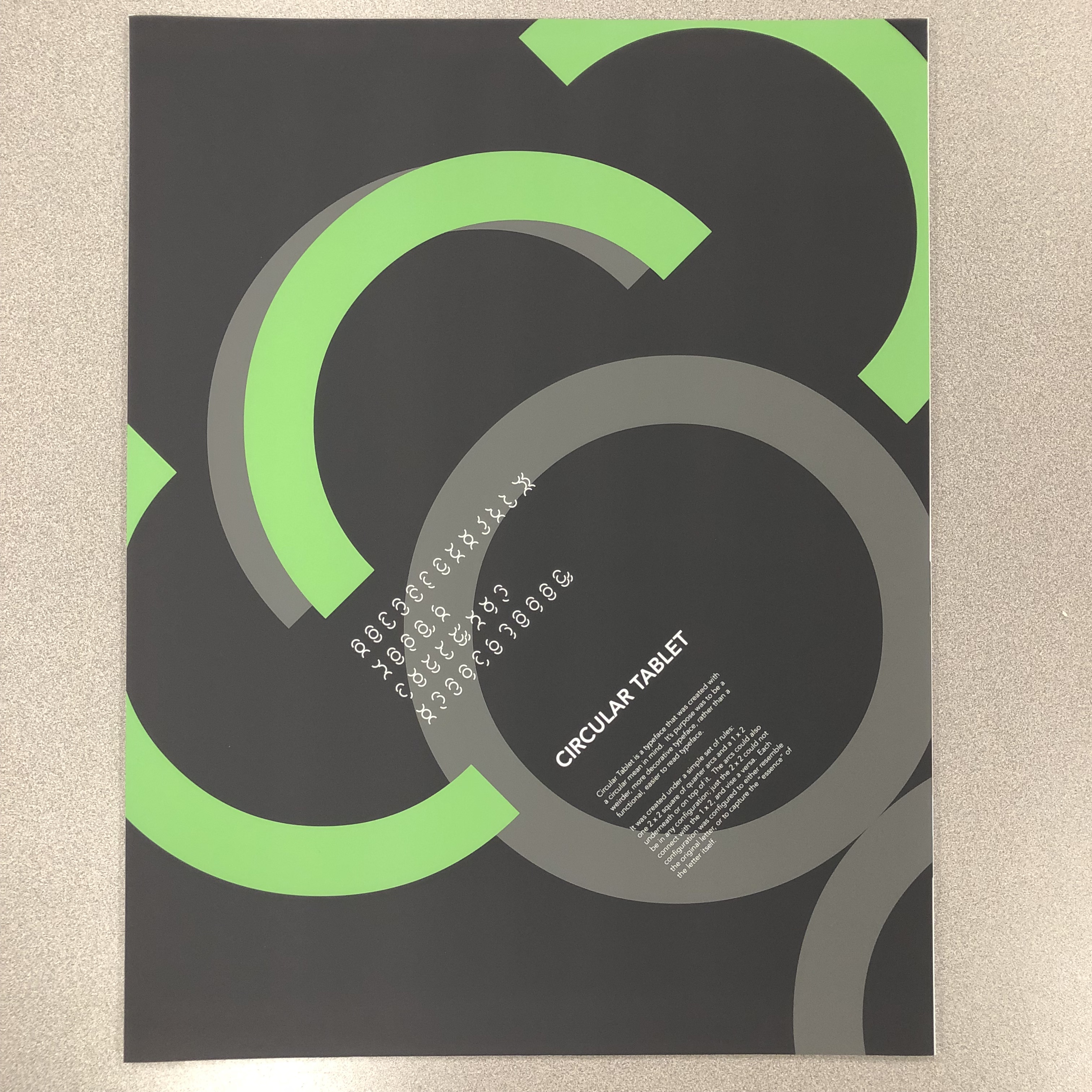
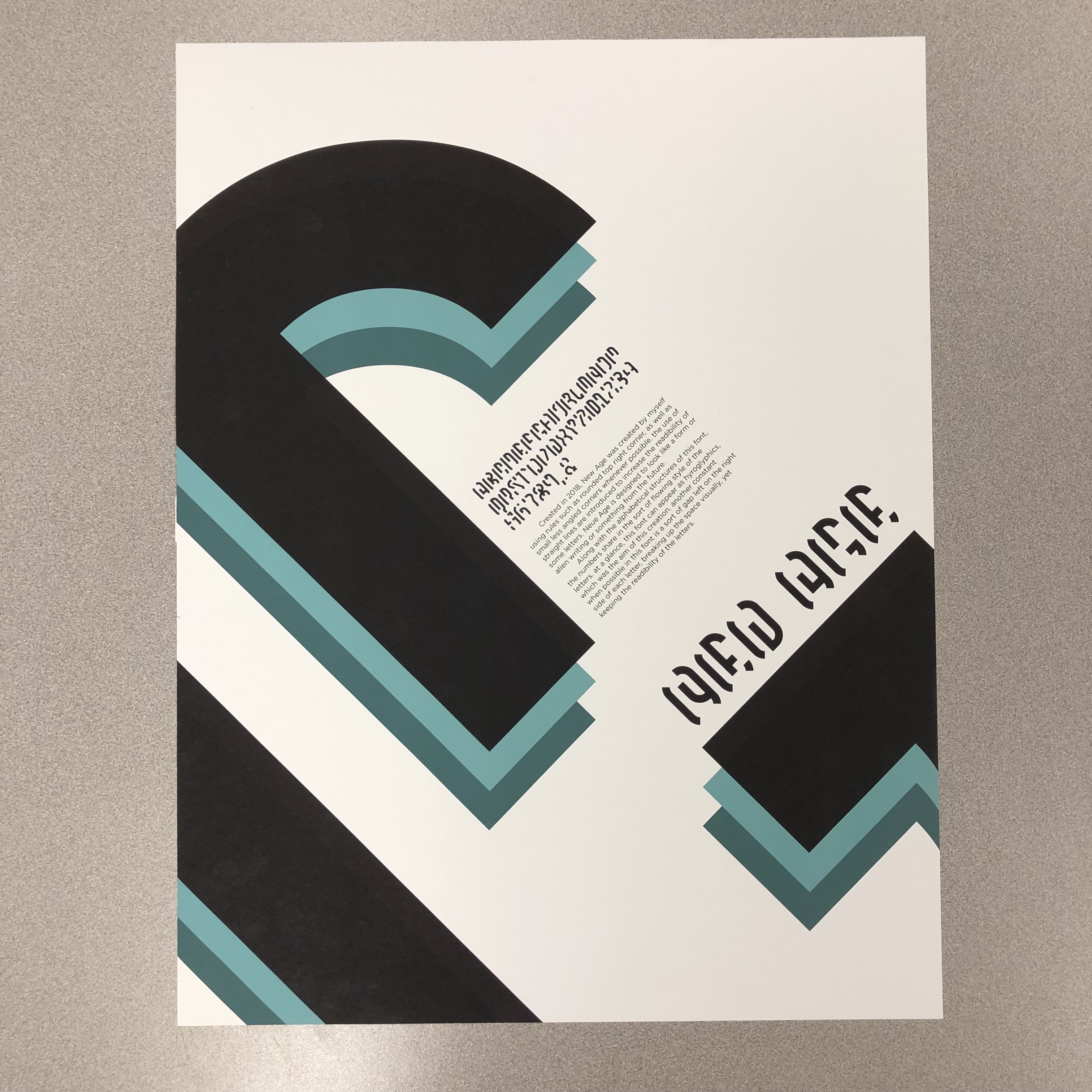
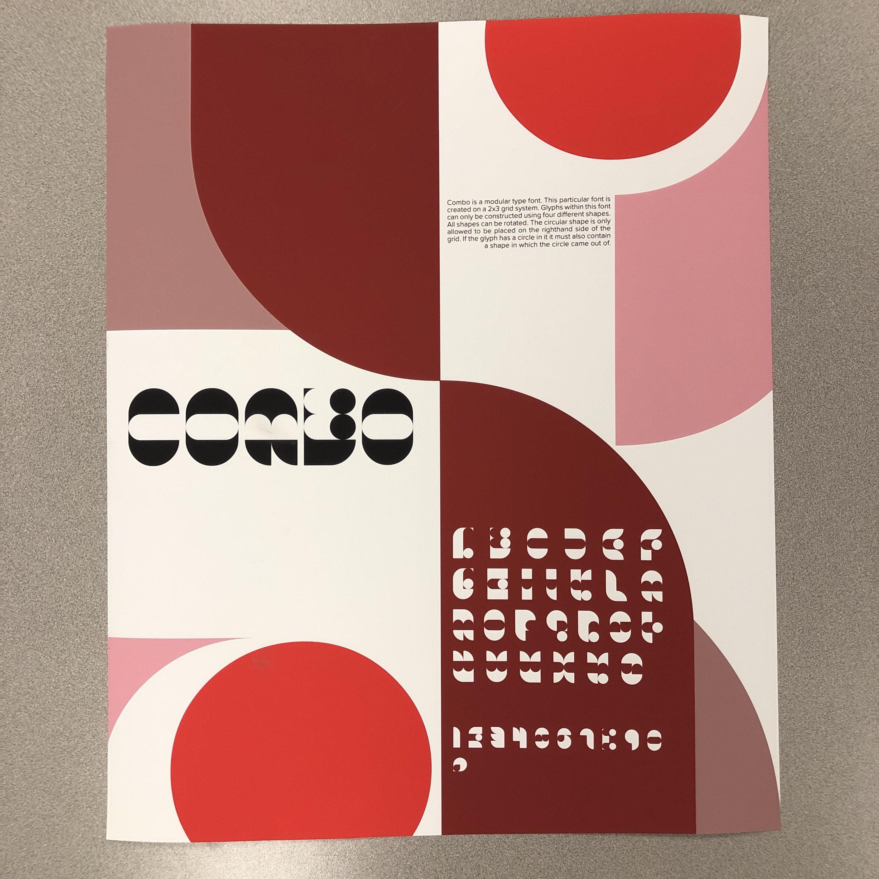
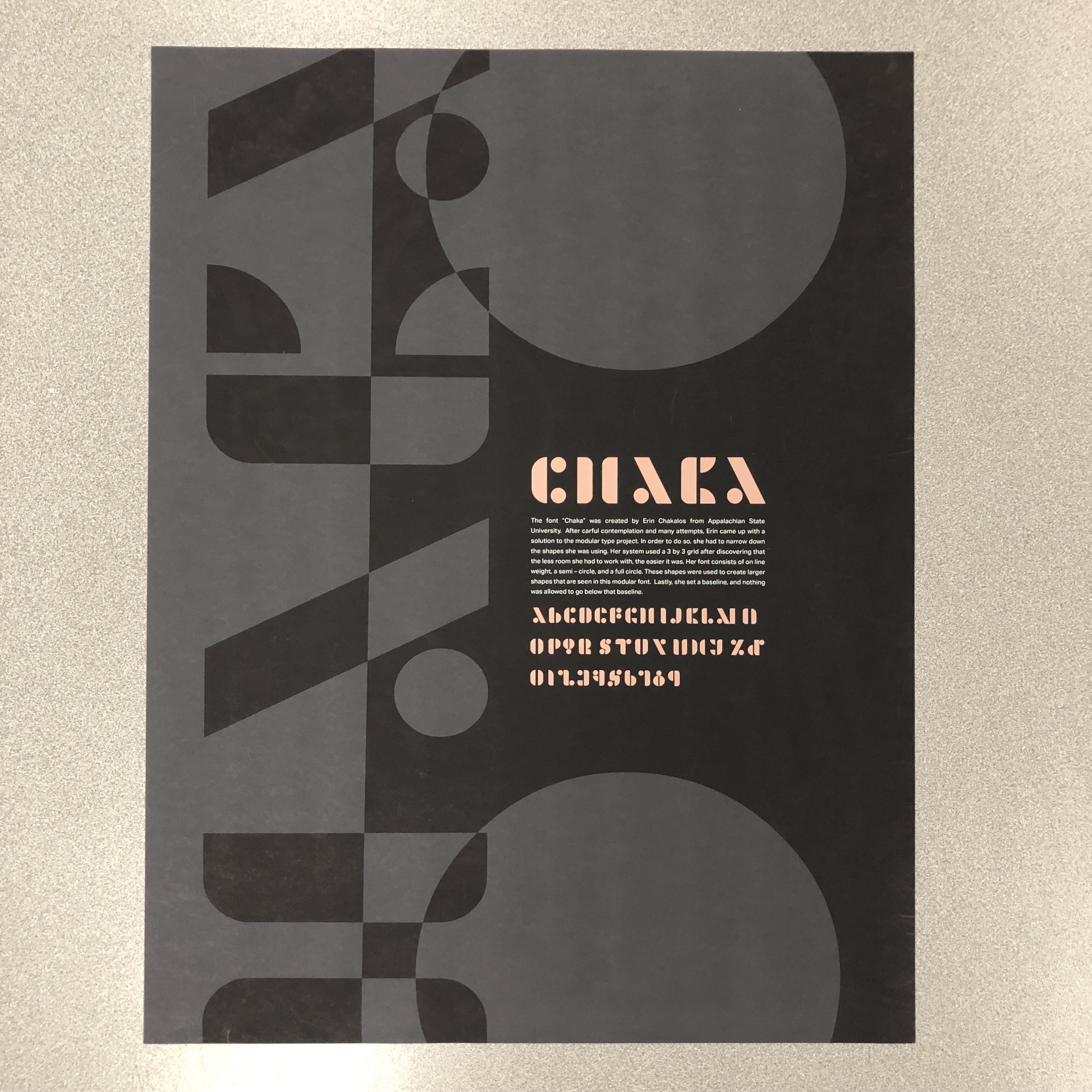
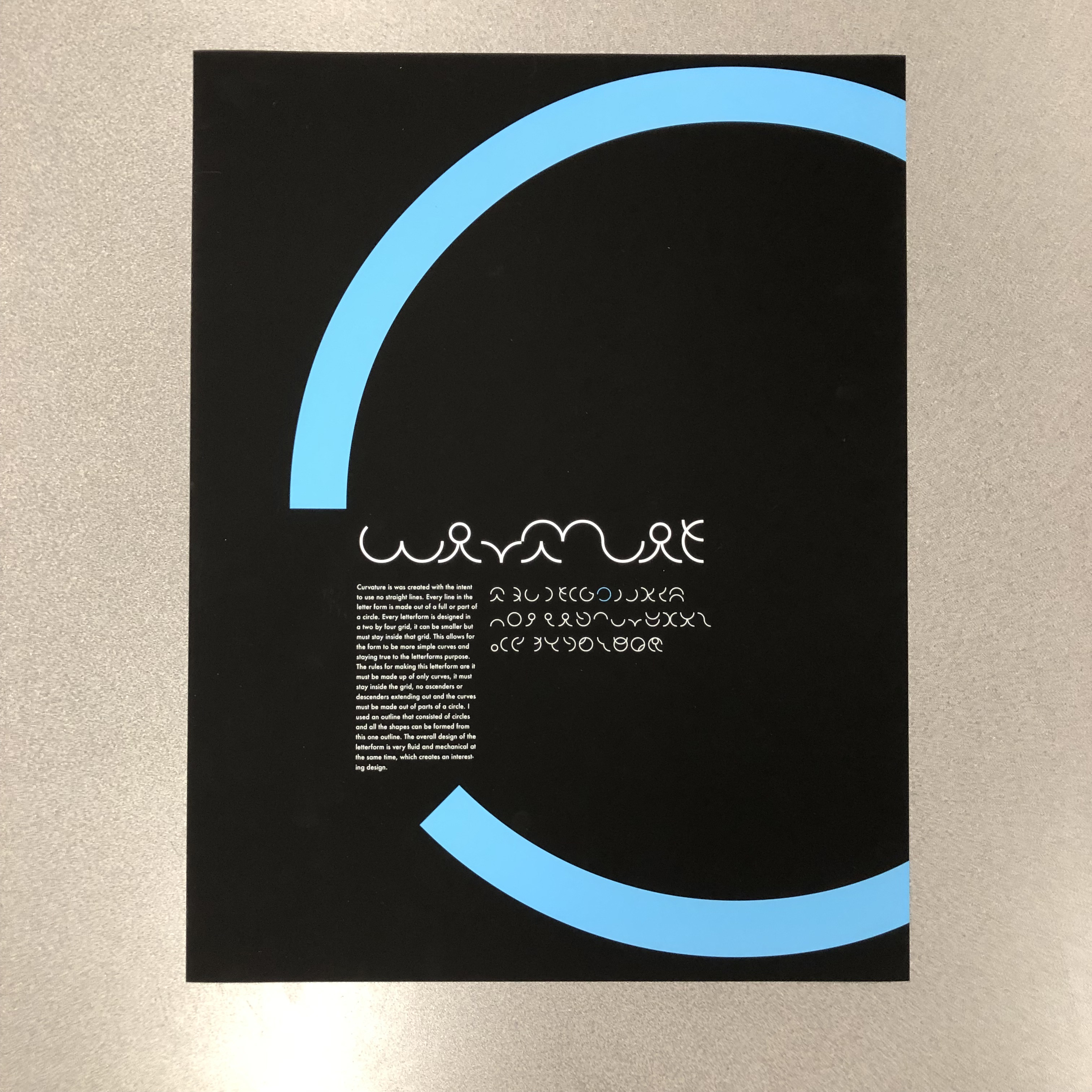
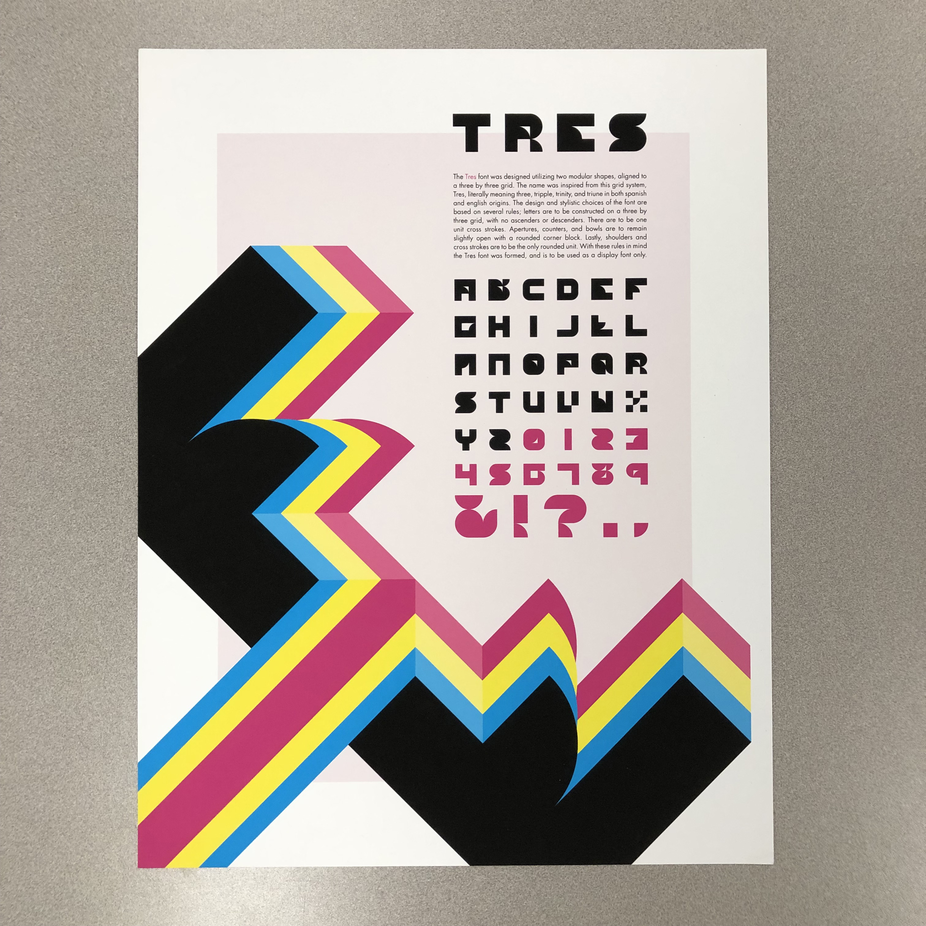
Students in introductory typography use >Fontstruct to create a constructed script. Different iterations of the course have had students making a specimen sheet and setting a pangram, or creating a specimen poster.




Affordance exercise
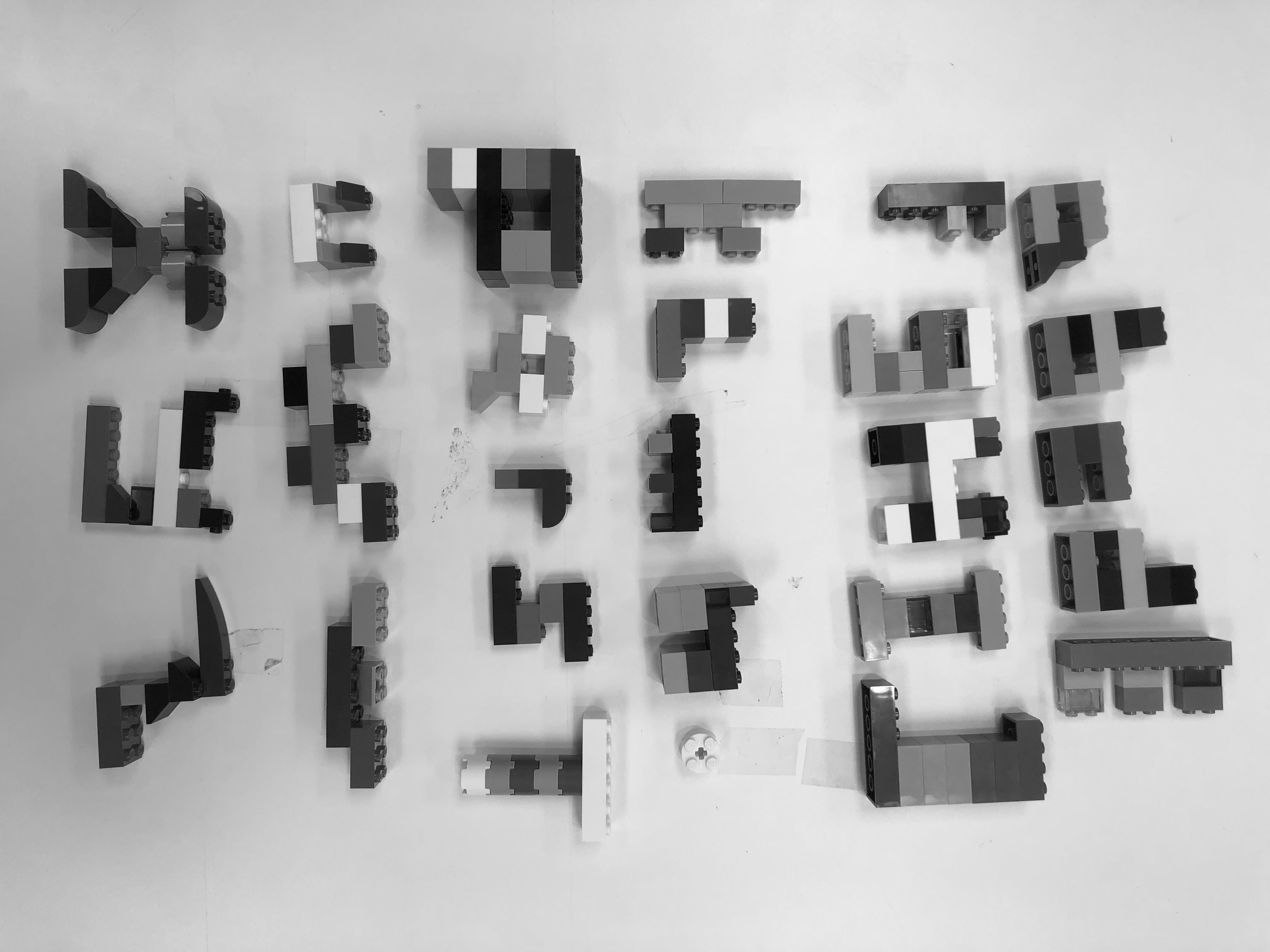
Students make letters out of Lego sets according to various parameters (one letter as large as possible, as small, make as many as you can, etc.). The exercise is designed to sensitize students to the formal and material affordances of the Legos and experience the difference between making letters out of a design space or material, on the one hand, and finding letters in that space or material on the other. The lessons and experiences carry over into larger projects in found- and constructed material lettering, and modular lettering.
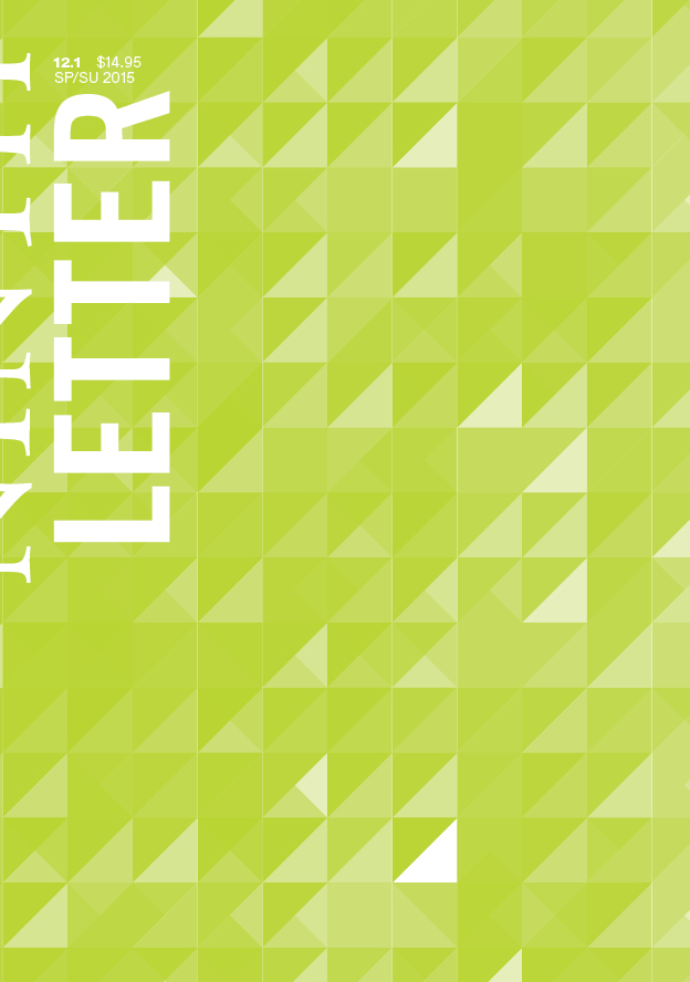
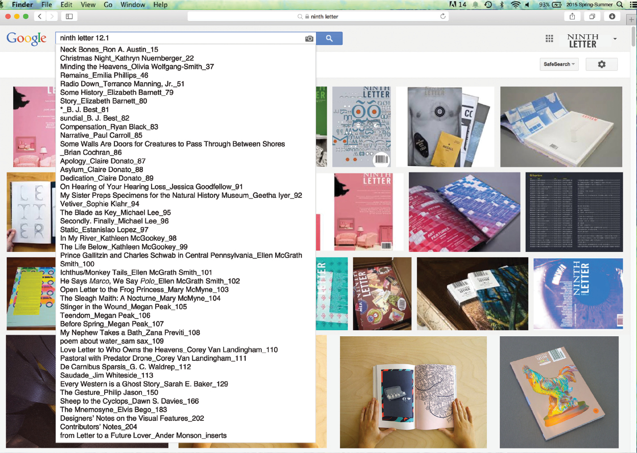
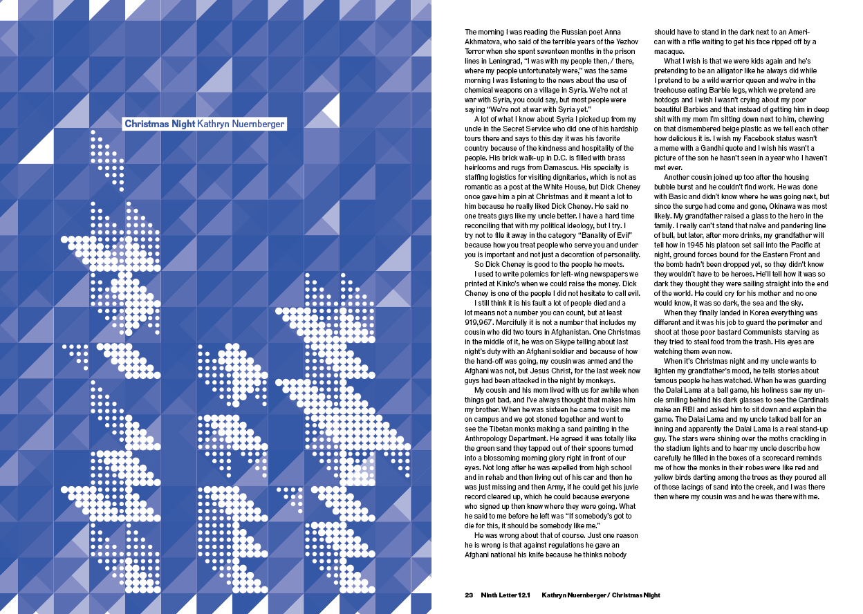
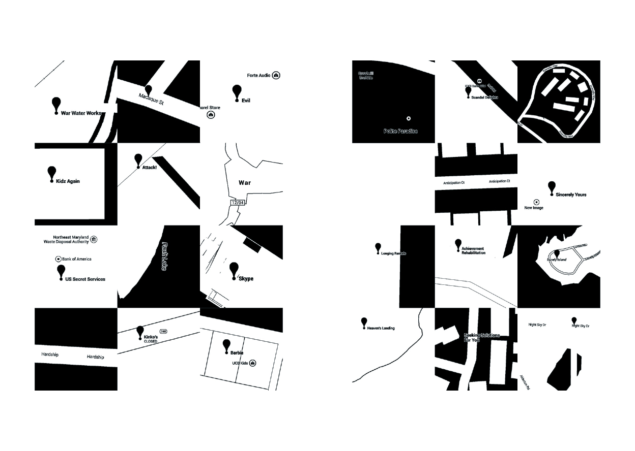
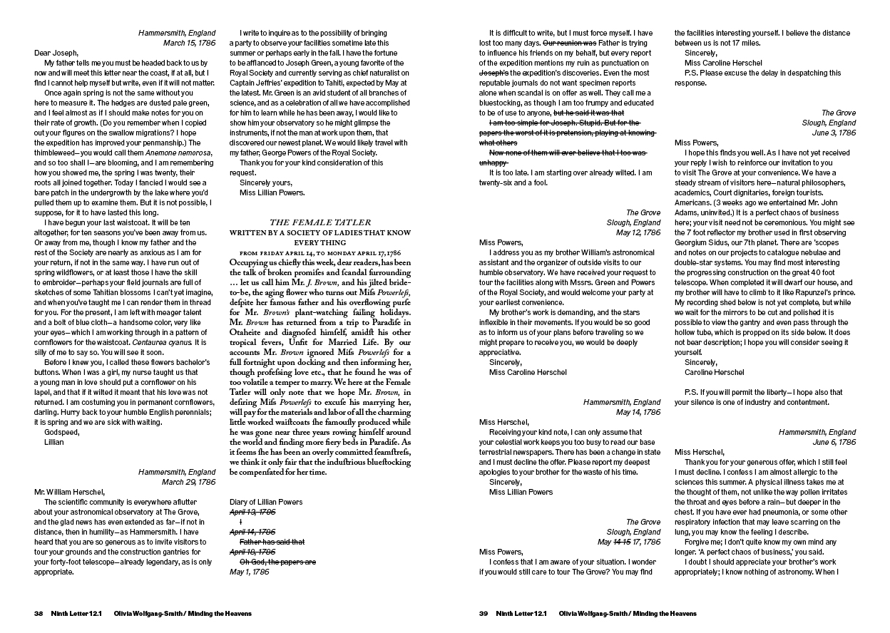
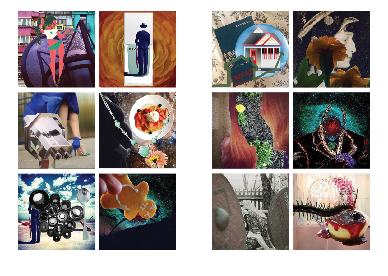
Ninth Letter 12.1 (Spring 2015)
Guest typeface ThreePoint courtesy MuirMcNeil
Featuring student art from studio visits by Paul Soulellis




Ninth Letter 11.2 (Fall 2014)
Art/production directed and co-taught with Marit McCluske
Featuring artwork by Brian Ewing

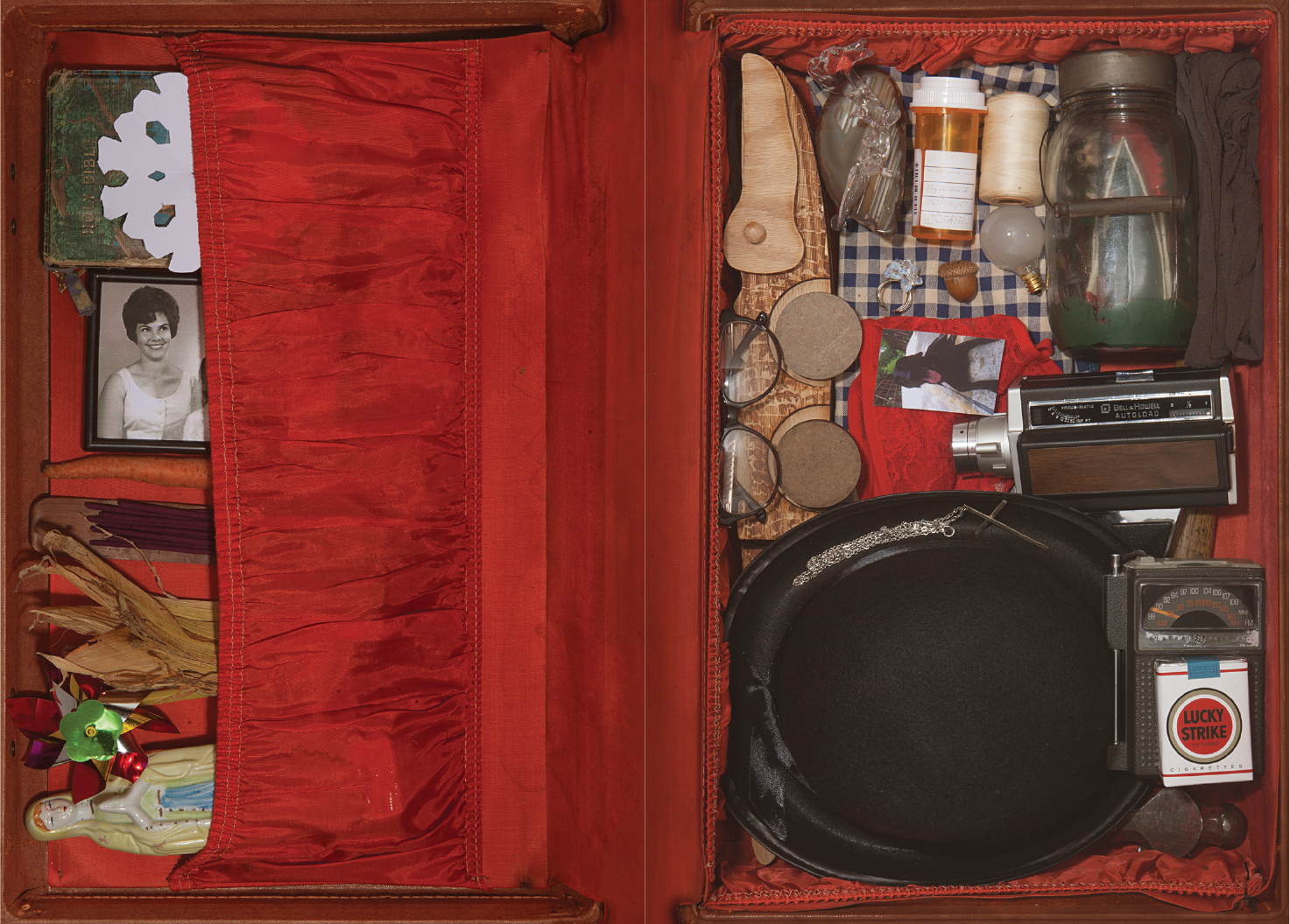

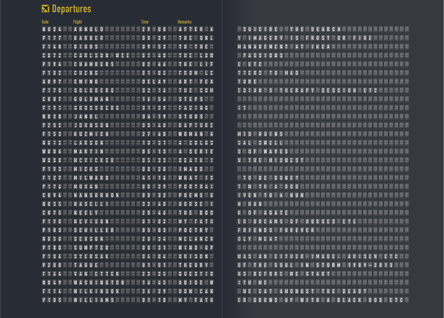

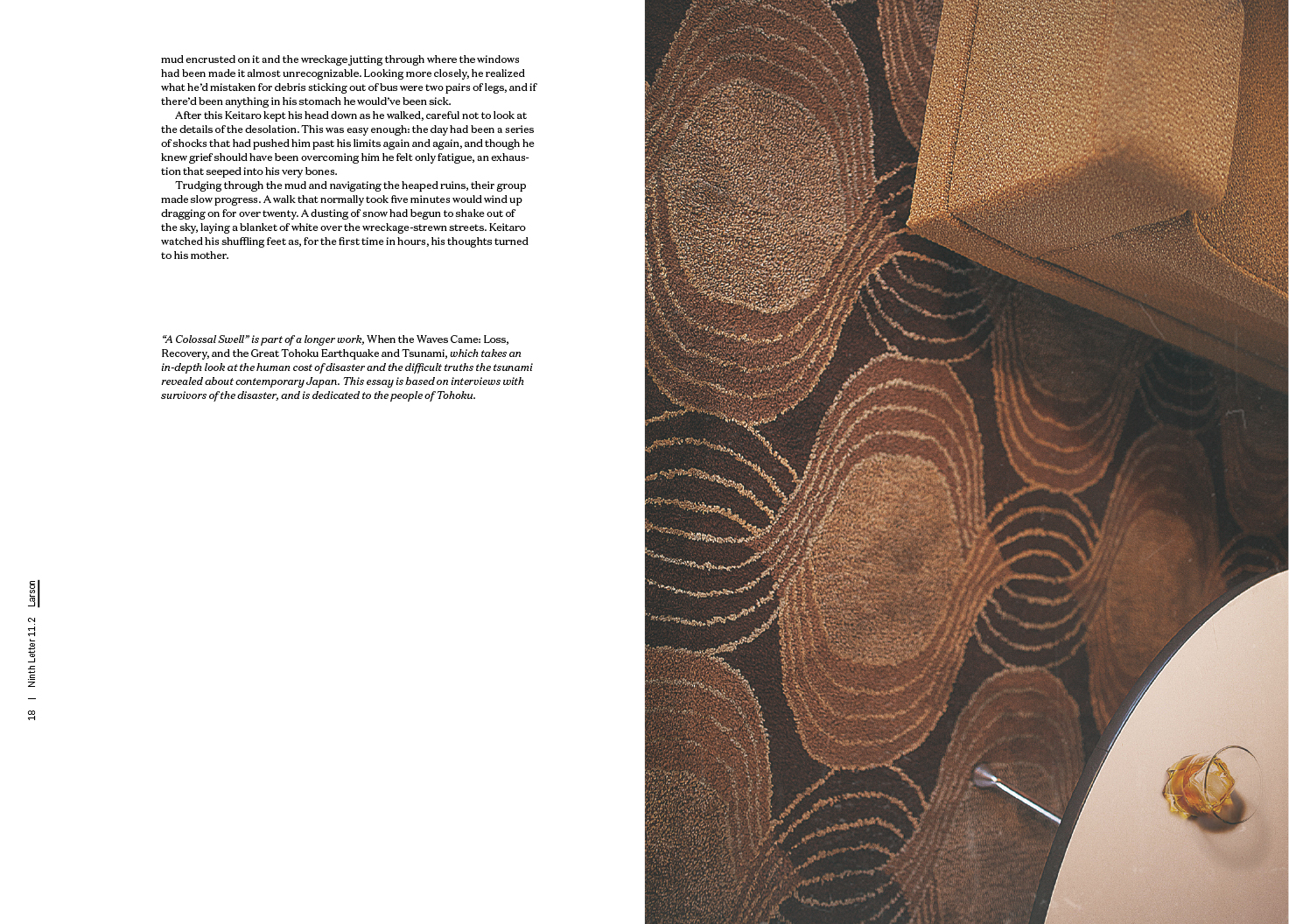



Ninth Letter 11.1 (Spring 2014)
Art/production directed and co-taught with Brian Wiley; guest typefaces Ludwig, Arnhem, and Fakt courtesy OurType/Fred Smeijers, Thomas Thiemich
Featuring student art from studio visits with Adam Setala, Studio Set, and Zut Alors!


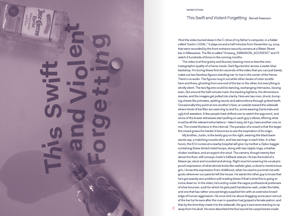


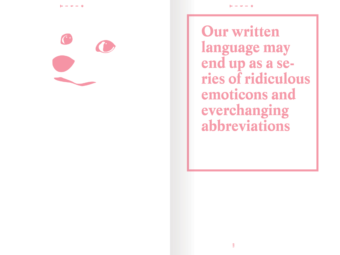

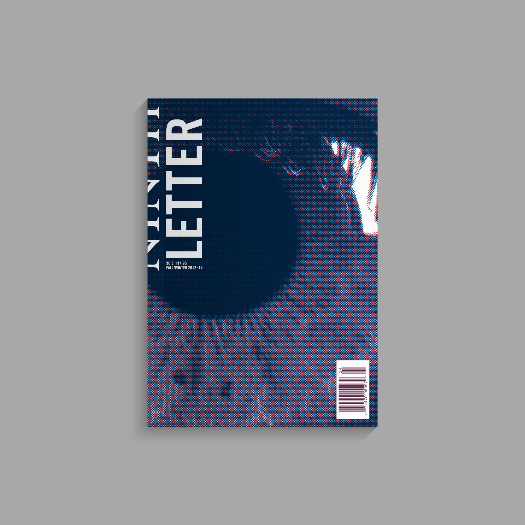
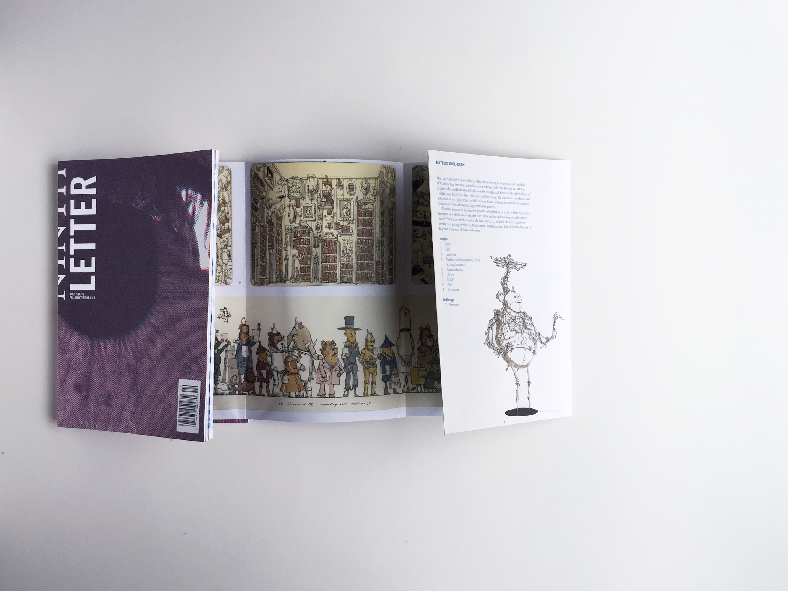
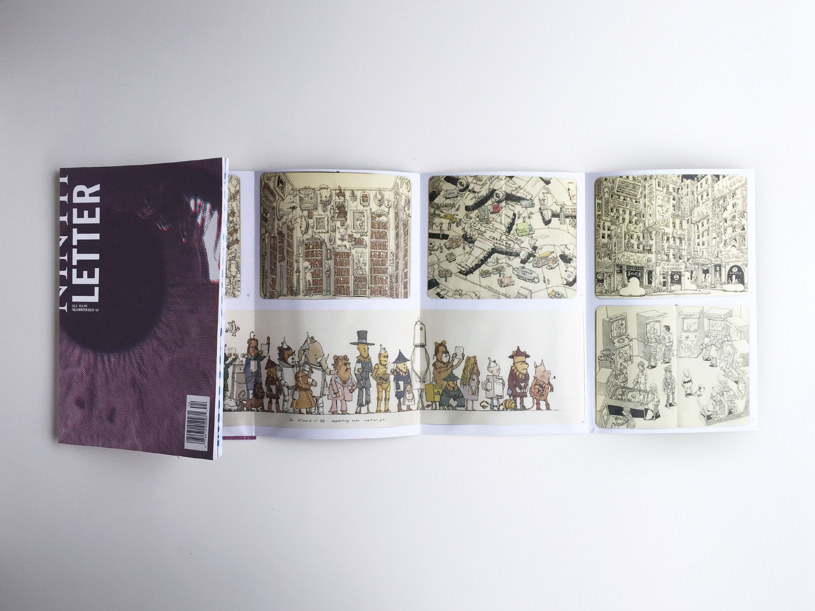
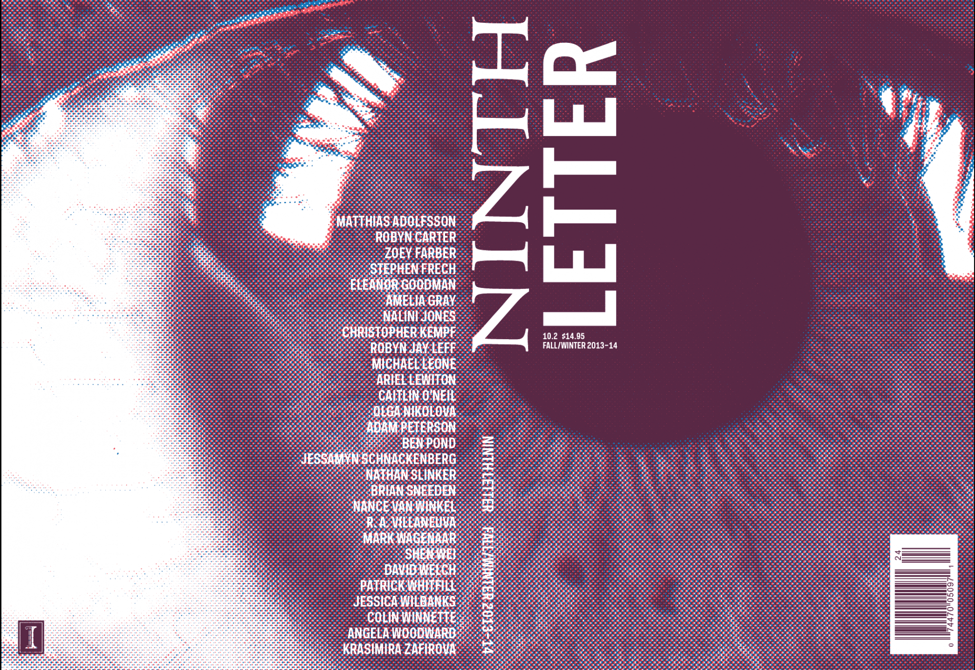
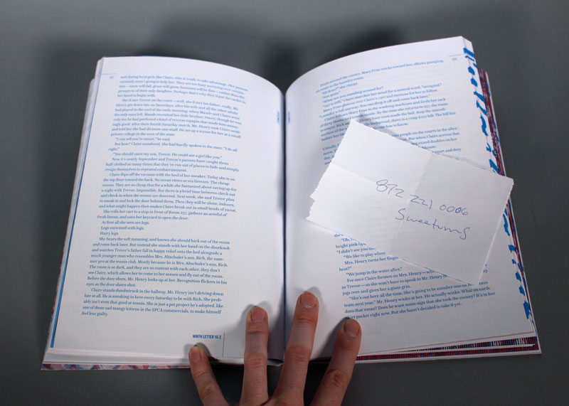
Ninth Letter 10.2 (Fall 2013)
Art/production directed and co-taught with Brian Wiley; guest typeface Questa courtesy Martin Majoor and Jos Buivenga
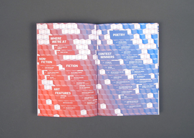
Featuring drawings by Matthias Adolfsson and art by Ben Pond
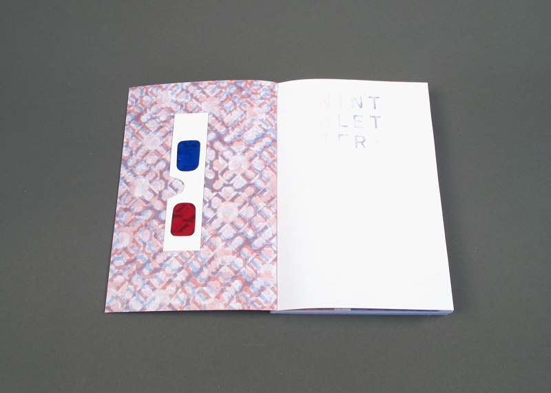
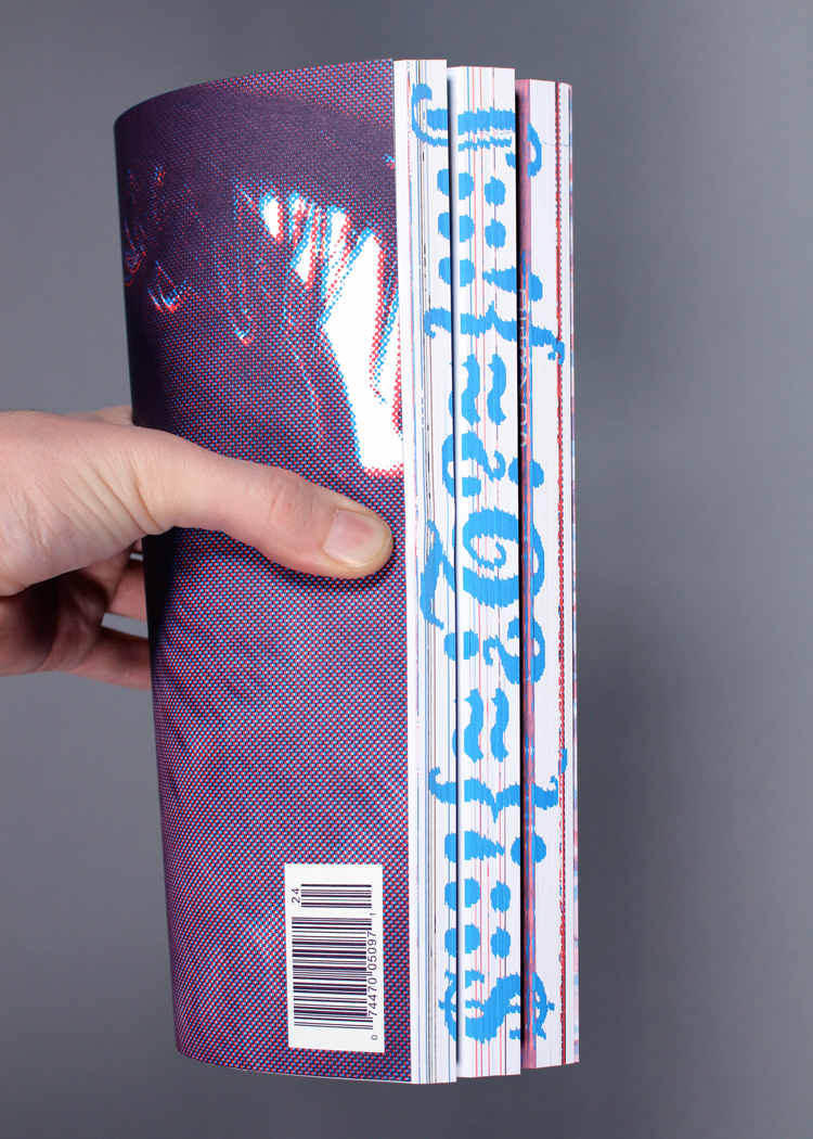
Ninth Letter is the nationally-recognized and award-winning arts and literary journal of the Creative Writing MFA program at the University of Illinois at Urbana-Champaign. The journal is edited by faculty and graduate students in the creative writing program, who hand the text off to selected undergraduate and graduate students in UIUC’s School of Art+Design to make into a journal. A faculty member in the graphic design program art- and production-directs the journal and teaches the course the student designers are enrolled in.
